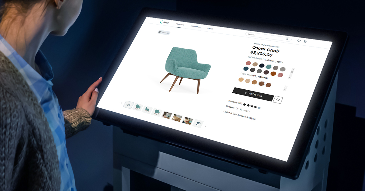
As our world went through rapid changes, we recognized a need to dig deeper into the evolving furniture retail playbook and understand what makes a delightful online shopping experience.
To understand the elements of an effective online furniture shopping experience, we dissect the online buyer journey of the three companies from our Top 100 U.S. Furniture Retailers report that have the highest ranking based on the number of adopted features and quality of product visuals.
1. IKEA
IKEA is a Swedish-founded, multinational group that offers a wide range of well designed, functional home furnishing products. Besides the affordable furniture, they’re known for sustainable sourcing of cotton and wood and a democratic design approach.
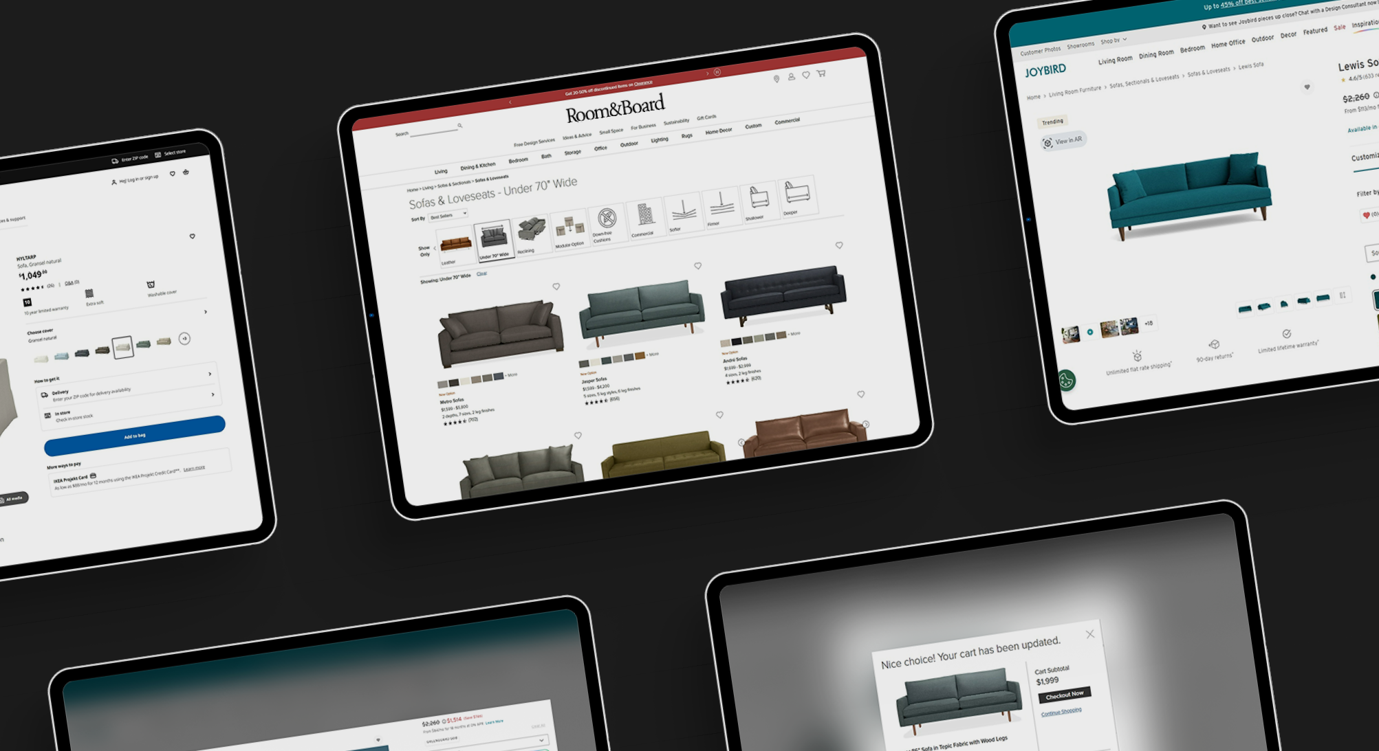
In our Top 100 U.S. Furniture Retailers report, IKEA ranks first with the highest e-commerce merchandising index (91). The results from our research show that IKEA has all the analyzed features and high-quality visuals.
On the homepage, there are thumbnail images of different product categories that customers can explore to find what they need. Besides this, on the home page, customers can find seasonal offerings, popular categories, Instagram inspiration, and sustainability tips and ideas.
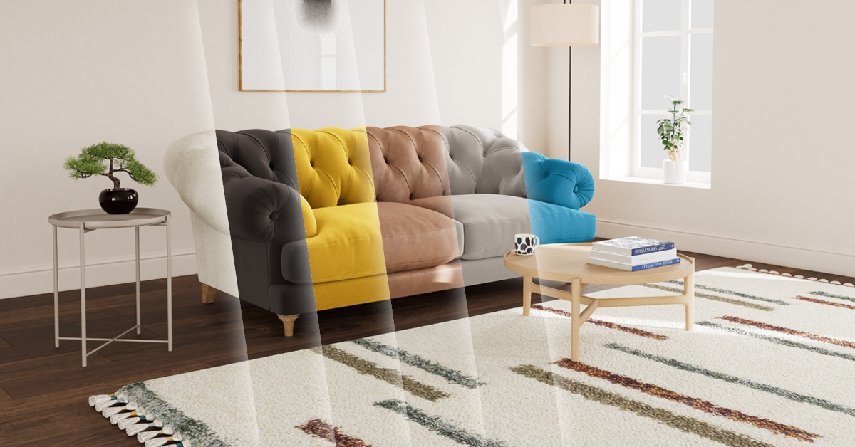
 Once you select the product category, you’ll see the product feed with different filtering options: seats, shape, materials, color, price, etc. Beside the product thumbnail, you can see a lifestyle image when hovering. Under each product, there is information about the price, as well as available colors, that you can preview by picking out a color without opening the product detail page.

When you enter the product detail page, on the left, you can see multiple product images, room scenes, 3D view, and close-up shots. On the right, you can see price information, different colors available, and delivery information.

Below the product images, there are different recommendations based on similar products, compatible products, recently viewed products, as well as products from the same line.
 The product details, size, and reviews are displayed as pop-up windows that open on click. Besides the basic five-star reviews, you can see the average rating and also information about value for money, product quality, appearance, and whether the product works as expected. IKEA also allows you to filter by the number of stars and also sort reviews by selecting most recent, oldest, highest rated, lowest rated, and most helpful.
 When you click the “add to cart” button, you can see a pop-up with product recommendations. IKEA has this pop-up on the mobile version as well. Before the checkout, you can see the image of the product in the specific color you’ve selected and price information. The customer can easily add more products from the recommendations.
 IKEA gives the customers a guest checkout option but also reminds them to log in for faster and easier checkout, listing all the benefits of creating an account.
 On the checkout page, the customer can review the order and then fill in the three steps: Add a zip code to see available delivery and pickup options, enter personal details, and choose a payment method. At this point, customers can also book TaskRabbit assembly. This is a for-hire service that helps IKEA customers to get their furniture assembled.

The overall shopping experience on the IKEA website is pleasant. Better consistency in the visuals and arrangement of images on the product detail page would make the consideration process much easier. Also, the pop-ups for certain parts of the experience, like product reviews, description, and size, work well on desktop but are not the best solution for mobile shopping.
2. Room & Board
With more than four decades of experience, Room & Board is one of the leading modern furniture players focused on American craftsmanship and the use of sustainable materials.
In our Top 100 U.S. Furniture Retailers report, Room & Board has the second-highest digital merchandising index (89). The results from our research show that Room & Board has all the analyzed features and high-quality visuals.
On the homepage, there is a navigation bar with a drop-down menu, and once you select a category, you can see featured product categories presented with lifestyle images. When browsing on mobile, you’ll notice a hamburger menu in the top left corner where you can choose product categories.
 Once you select the product category, you’ll see the product feed with different filtering options: fabric, size, reclining and modular option — each presented with a thumbnail image. On the left side, you can choose whether you want to see bestsellers, highest rated, newest, or filter products alphabetically or by price.
Under each image on the product feed, there is information about the price range, number of colors, sizes, and finishes that you can choose from, as well as the number of reviews.
 When you enter the product detail page, on the left, you can see multiple product images or get a 360-degree view of the selected product. Room & Board has a full screen mode where customers can explore the product in 360 degrees and zoom in on the details.
 Besides the rich e-commerce merchandising features on its product pages, Room & Board allows customers to use AR and see how a furniture item fits in their space. Visitors can experience AR straight through the browser without the need to download an app, which removes friction and creates a smooth and seamless customer experience.
 On the right side, there is a product configurator where customers can select the size, fabric, leg style and finish, etc. The different options are shown with a thumbnail image, which makes the customization simple and straightforward.
 Below the fold, there is a manual control carousel with different lifestyle images and shoppable content. Room & Board also has product videos, as well as detailed product descriptions and dimensions.
 On the product page, customers can also see a section with personalized recommendations for other complementary products that look good with the selected item.
 At the bottom of the page, customers can read reviews and filter them by most recent, most helpful, lowest rated, highest rated, oldest, or reviews with images.
 When you click the “add to cart” button, you can see a pop-up with product recommendations. Room & Board has this pop-up on the mobile version as well.
 Before the checkout, you can see the products in your shopping cart, the total price, the expected delivery date based on the zip code, as well as reminders for the financing options and returns and guarantee policies. Customers can also see product recommendations for other products they may like.
Room & Board uses cart thumbnails in the exact color the customer has chosen, which decreases the number of product returns. Removing products from the cart is simple and straightforward.

Customers can sign in or check out as a guest. There’s a five-step process on the checkout page where customers fill in the delivery address, delivery details, billing address, contact preferences, and payment information.
 The overall shopping experience on the Room & Board website is pleasant, straightforward, and rich, with engaging features such as 360-views, augmented reality, product configurator, and shoppable content. All these elements create a seamless customer experience and ease the decision-making process.
3. Joybird
Joybird specializes in high-quality, customizable furniture in modern and mid-century styles. As a technology-centric company, they are committed to developing innovative digital experiences that facilitate one-on-one conversations with users.
In our Top 100 U.S. Furniture Retailers report, Joybird has the third-highest digital merchandising index (88.5). The results from our research show that Joybird has all the analyzed features and high-quality visuals.
There is a navigation bar with a drop-down menu that opens on hover when you enter the home page. When browsing on mobile, you’ll notice a hamburger menu in the top left corner where you can choose product categories.
 When you open the product feed, you can see visuals for different products. Under each image, there is information about the price as well as color options that you can choose from and get a thumbnail preview without entering the product detail page.
Besides category filters, there are many other filtering options like material, style, features, width, etc. On the right side, you can filter products by color or choose whether you want to see new arrivals or filter products alphabetically or by price.
 When you open the product detail page, there are thumbnail images below the main visual that change on hover. This is different on mobile, as customers can swipe to go through the images. Besides the main visual, there are lifestyle images, a video, alternate angles, and dimension shots. Customers can also zoom in and view the product in 4K.
 On the right side, there is price information and a product configurator where customers can choose between popular, velvets, pet-friendly, safeguarded, and sustainable materials. As you scroll down the product detail page, you’ll notice the sticky header with a price and a “customize” button.
Below the configurator, the customer can get more information like product description, dimensions, reviews, and product care. Furthermore, there’s information about the delivery below the “add to bag” button.
Customers can visualize Joybird’s products in their space using web-native augmented reality. This way, customers can virtually try out furniture, not worrying about bad decisions and removing a huge weight from their shoulders before the big purchase.
 Joybird gives customers recommendations based on products that pair well with the selected product but also similar products that the customer may like.
 When you click the “add to bag” button, there is a pop-up with a small thumbnail image of the product, total price, and an option to check out or share the cart with friends and family. There is also a tab with recently viewed products.
 When you click the “checkout” button, the default option is to check out as a guest, where customers are first asked for their email address. There’s also a sign-in option for users who already have a Joybird account. At the top, there’s a progress bar with five stages: email, shipping, delivery, protection, and billing.
 The overall shopping experience on the Joybird website is clean, pleasant, and engaging. There is great consistency in the visuals and buyer journey across devices, which gives customers confidence when making a purchase. The mobile experience is optimized and functional.
Transform your online shopping experience today
Ready to explore the benefits of 3D product visualization technology and discover how it can help you create an engaging furniture shopping experience? Let's talk.