Key points:
-
Digital-First Discovery: Over 70% of furniture shopping journeys begin online. Your product page is no longer just a digital catalog; it is the primary engine for building the trust required for big-ticket purchases.
-
Visualization as a Conversion Catalyst: High-fidelity 3D assets—including 4K zoom and 360-degree spins—compensate for the lack of tactile experience, significantly reducing cart abandonment and returns.
-
Personalization at Scale: Modern shoppers expect the ability to configure fabrics, finishes, and sizes in real-time. Brands that provide interactive customization see higher engagement and a clear competitive edge.
The battleground for consumer attention has shifted online. If you fail to deliver an engaging product page experience, you will never turn visitors into customers.
The good news: This article will help you understand the anatomy of a perfect product page and how to optimize your digital experience to increase conversions and average order value.
Today’s Shopping Journey Starts Online
When was the last time you went directly to a store for a big-ticket purchase without looking it up first? For most, that journey is a relic of the past. According to Salesforce, 87% of consumers begin their shopping journey online, and digital influences up to 75% of all in-store visits.
While some argue that showrooms remain the primary revenue driver for furniture, technology has shifted the balance by instilling trust and confidence in shoppers long before they step foot in a store. Today, 47% of Millennials research furniture items online before buying them in brick-and-mortar locations. If you can create an experience that answers every question visually, people are more than willing to click "add to cart."
What Makes a Furniture E-commerce Product Page Perfect?
Beyond the basics like pricing and shipping, a high-performing product page must stand out from the crowd through technical sophistication.
Here are the 7 essential components for success:
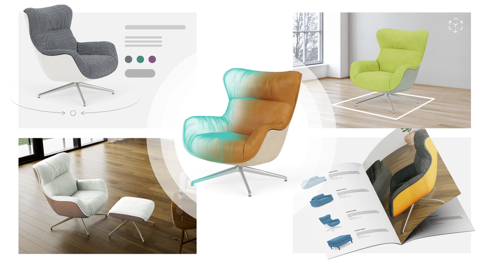
1. High-Quality Visuals and 4K Zoom
Using low-resolution images is the shortest path to losing a customer's trust. 3D product visualization now offers quality so high it is indistinguishable from photography, allowing users to zoom in on specific fabric weaves or wood grains. Research from UPS shows that 70% of users consider the zoom tool a primary factor in their purchase decision.
🚀 Real-world proof
Living Spaces utilizes Cylindo to offer 4K visuals with 1x, 2x, and 4x zoom levels. This allows shoppers to see the slightest details of photorealistic renders across both desktop and mobile, removing any mystery about the product's quality.
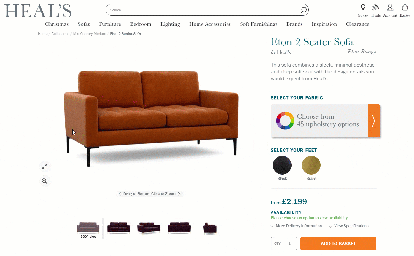
2. Engaging 360-Degree Spin
Shoppers want to see every angle of a product before they commit. Google’s metrics show that consumers interact with 360-degree spins four times longer than static photos. On marketplaces like Amazon, this feature has been shown to drive a 6-8% lift in conversion rates while significantly reducing returns.
🚀 Real-world proof:
Heritage retailer Heal’s provides 360-degree views to bridge the gap between digital and physical shopping. By allowing customers to examine products in extreme detail, they remove the "visual anxiety" that often blocks big-ticket online sales.
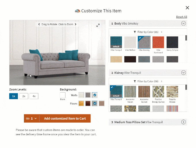
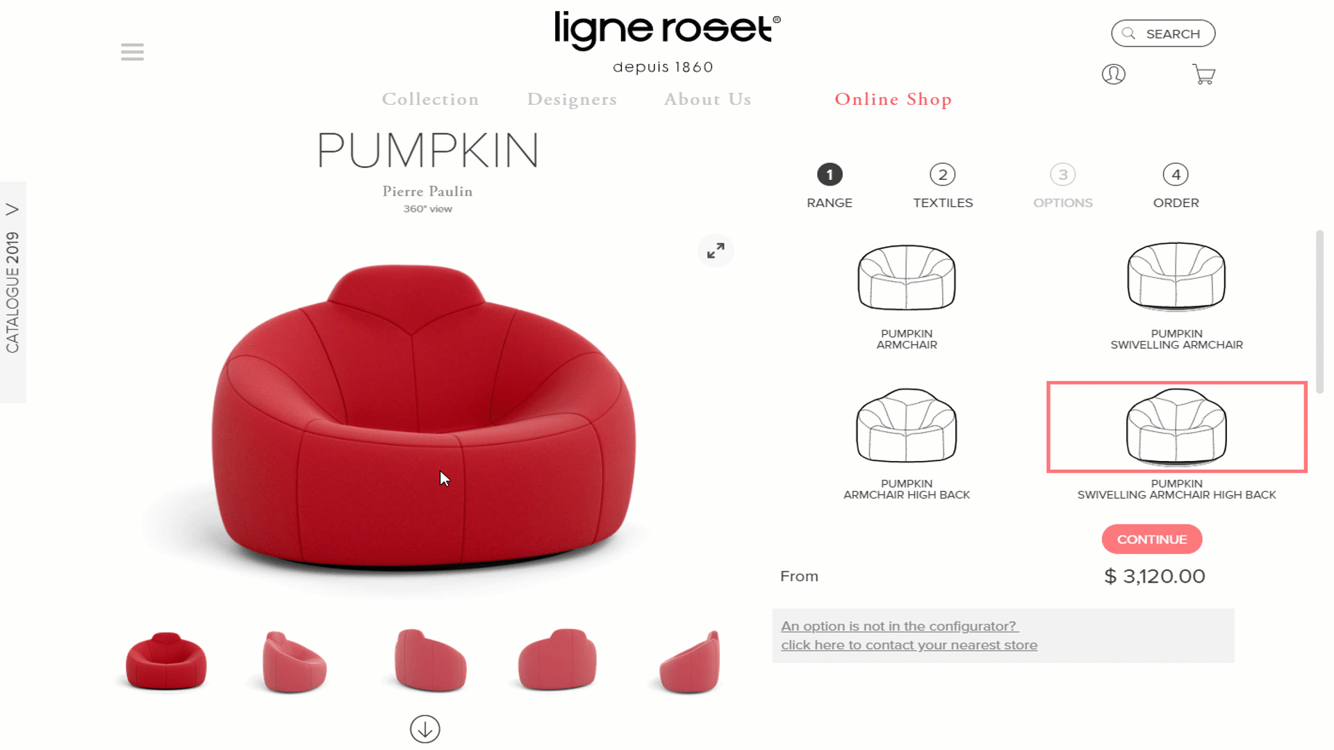
3. Real-Time Product Customization
Customization gives buyers a sense of power. According to Deloitte, 71% of consumers are prepared to pay a premium for a product they have customized themselves. For furniture, where color and fabric are paramount, a 3D product configurator prevents "analysis paralysis" by letting shoppers build their dream item in real-time.
🚀 Real-world proof
Ligne Roset uses step-by-step customization for size, textiles, and finishes. This turns a daunting choice into a smooth, interactive experience that increases both satisfaction and loyalty.
4. In-Context Room Scenes
Context gives a product shape and meaning. Seeing a sofa in a beautifully rendered room helps customers visualize how it will fit into their own life.
Google research shows that 64% of female smartphone users are positively influenced by in-context images. 93% of the U.S. Top 100 furniture retailers now use room scenes to explain scale and aesthetics.
5. Consistent Cart Thumbnails
A common mistake is using a generic thumbnail in the checkout cart, regardless of the customer's custom configuration. If a user builds a coral velvet sofa but sees a grey one in their cart, they will hesitate.
Providing exact configuration thumbnails ensures instant verification, which can increase conversion rates by up to 28%.
6. Intelligent Product Recommendations
Product recommendations help customers find relevant items quickly. Salesforce data shows that shoppers who click on recommendations are 4.5x more likely to complete a purchase.
Brands like Man of Parts use photorealistic recommendations to cross-sell items from the same designer, keeping visitors engaged for an average of 12.9 minutes per session.
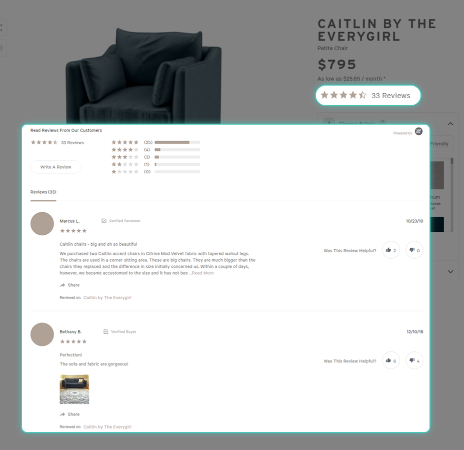
7. Reviews and User-Generated Content
Nearly 95% of shoppers read online reviews before making a purchase. For expensive furniture, reviews are often more trusted than in-store associates.
Interior Define excels here by allowing customers to upload real-life photos alongside their ratings, providing social proof that no studio photo can replicate.
Future-Proof Your Product Pages
Buying furniture is a cognitive process, not an impulse. To future-proof your brand, you must demonstrate value at every touchpoint. Using Cylindo's 3D visualization platform, retailers can create a consistent omnichannel experience that drives higher engagement and ROI.