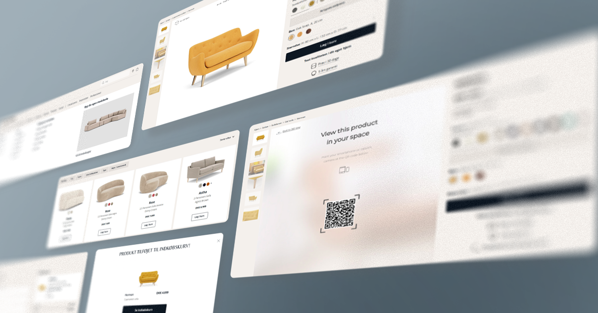
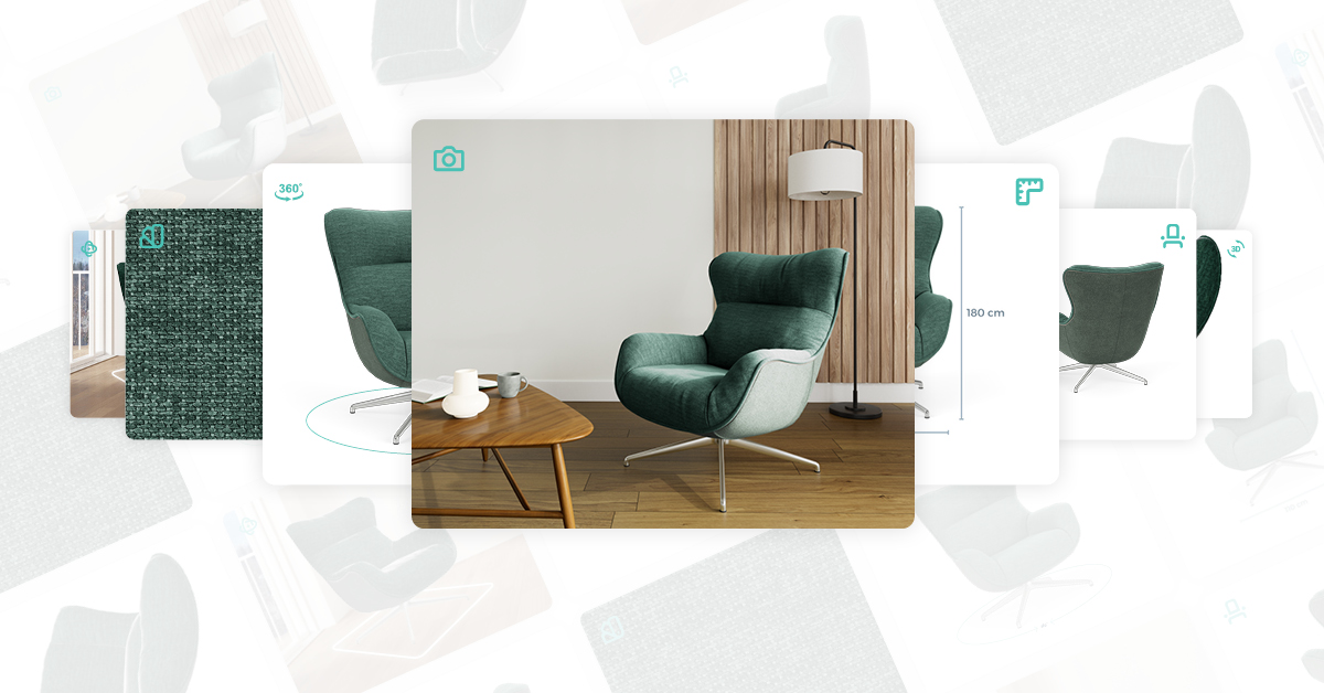
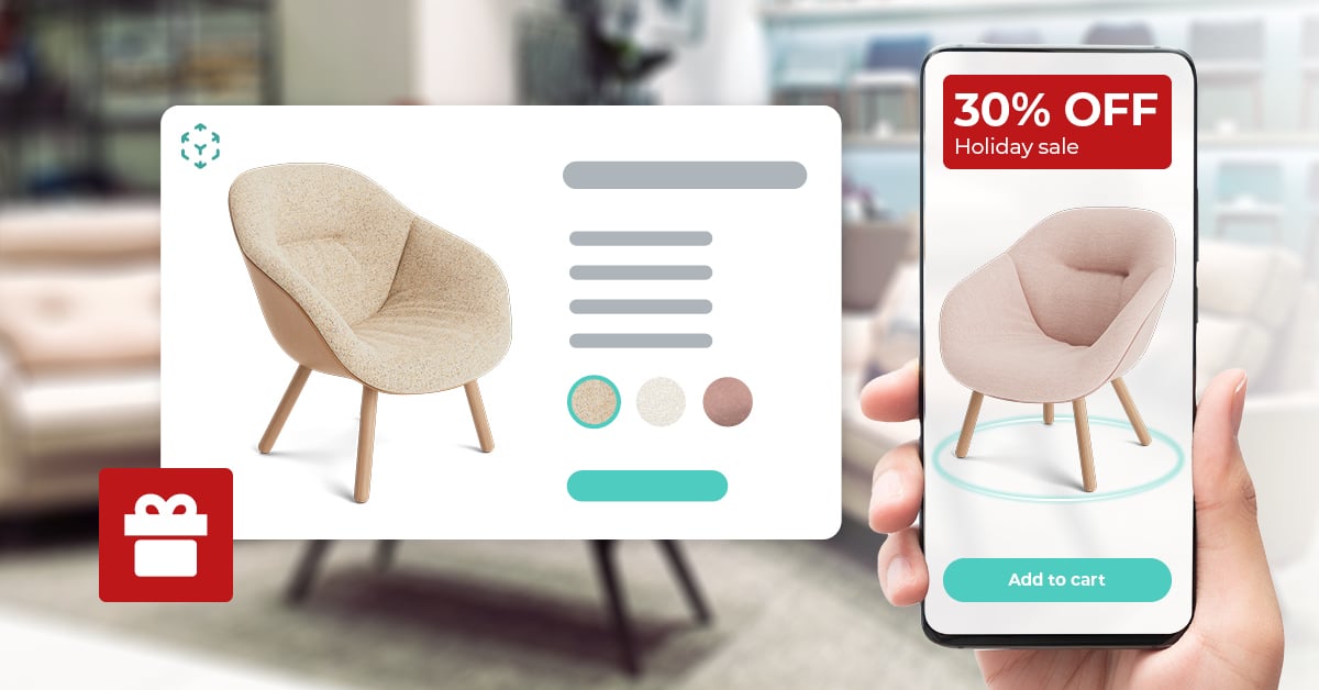
The influx of new DTC brands has raised customer expectations for online furniture shopping and helped drive growth within e-commerce.
To understand the elements of an effective online furniture shopping experience, we dissect the online buyer journey of the three companies from our Top 50 DTC Furniture Brands report that have the highest ranking based on the number of adopted features and quality of product visuals.
1. Sofacompany
Sofacompany is an online-first retailer on a mission to challenge the furniture industry by making high-quality Danish design available to all. What makes Sofacompany so special is the delightful end-to-end customer journey across channels.
In our Top 50 DTC Furniture Brands report, Sofacompany has the highest digital merchandising index (88.5). The results from our research show that Sofacompany has all the analyzed features and product pages rich with high-quality visuals.
On the homepage, there is a navigation bar with a drop-down menu that opens on hover. When browsing on mobile, you’ll notice a hamburger menu in the top left corner where you can choose product categories.
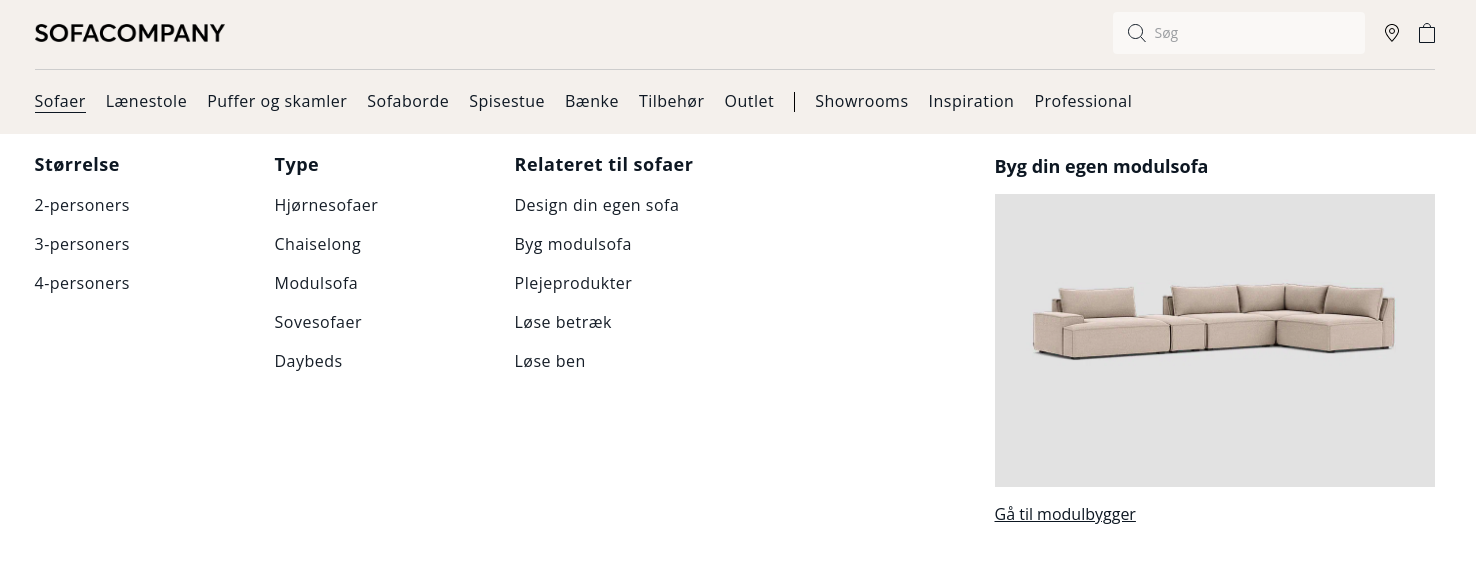
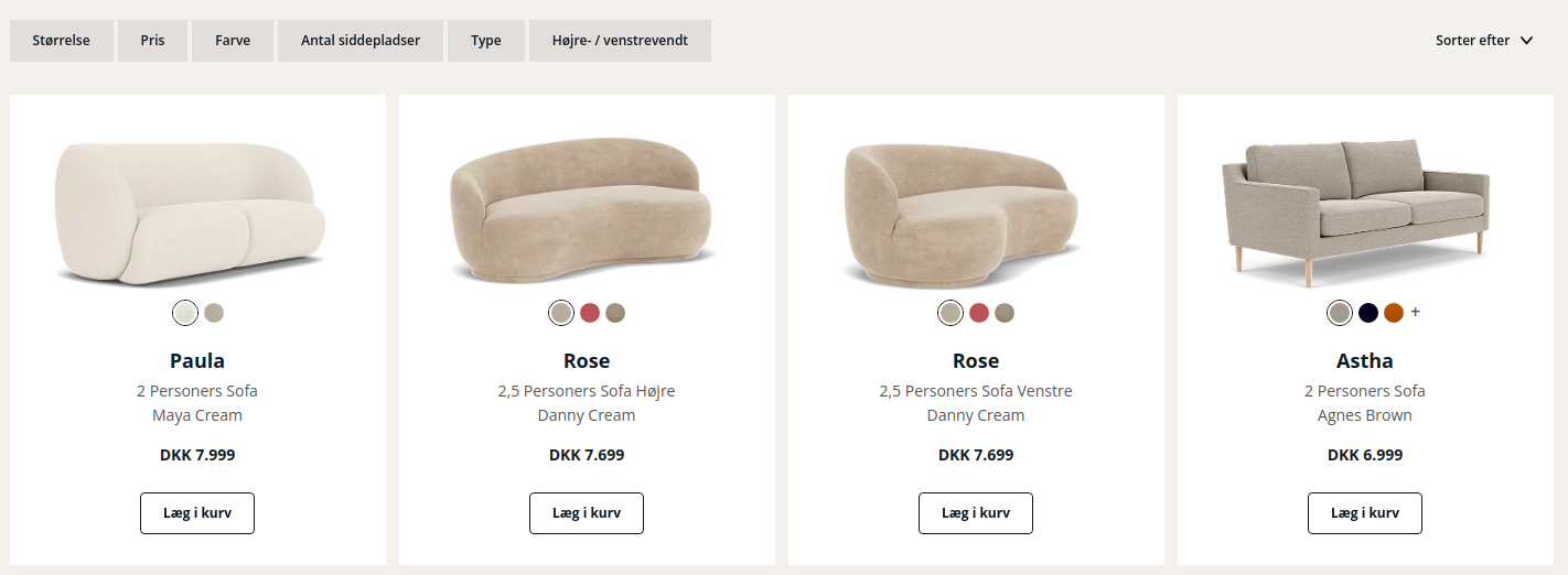
Once you select the product category, you can see thumbnail images for different products. There is information about the price and different product colors under each image. Besides this, you’ll see different filtering options: price, color, designer, and right/left facing.
On the right side, you can choose whether you want to see the most popular or newest or filter products, depending on the name, price, or which side they are facing.
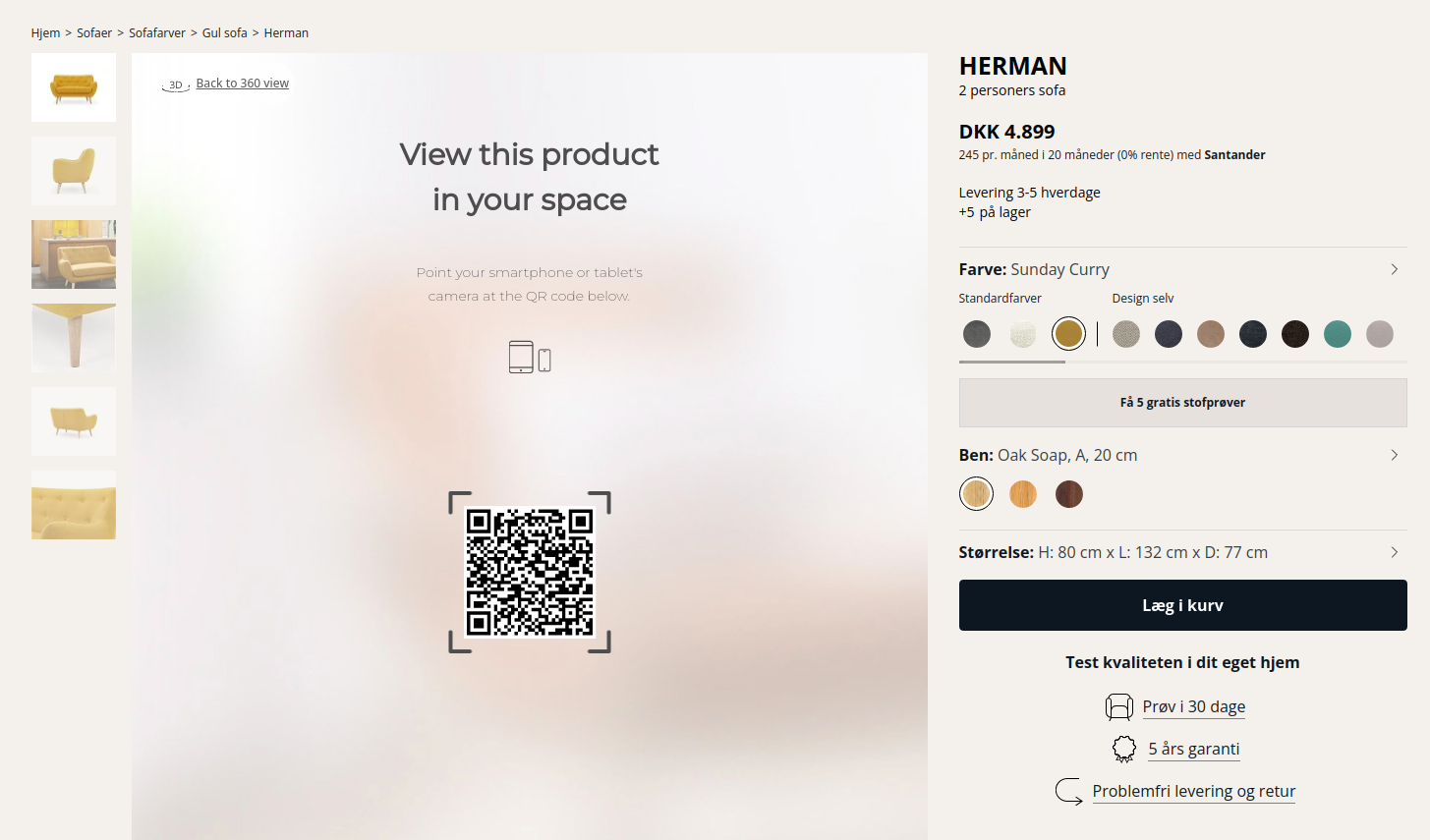
When you open the product detail page, on the left, you can see multiple product images, including lifestyle imagery, alternate angle images, and detail shots.
Using 3D product configurator software, customers can choose from a wide range of materials with different colors, patterns, and textures, as well as leg options. What’s more, there is an engaging 360-degree viewer and 4K HD zoom that lets customers scrutinize the details. On the right, there is price information and the ability to choose up to five free fabric samples.
The mobile experience with the 360-degree product configurator is equally pleasant and user-friendly.
.gif?width=960&height=599&name=sofacompany_2023-5-15%20(1).gif)
Another feature customers can enjoy while browsing the Sofacompany website is the “View in your space” button, which allows them to visualize the product in their home using augmented reality without downloading an app.
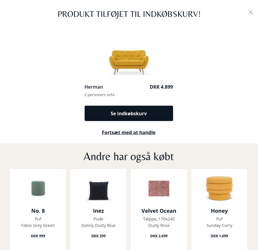
When you click the “add to basket” button, there is a pop-up with a thumbnail image of the product, the total price, and the option to check out or continue shopping. Below the checkout information, there are product recommendations.
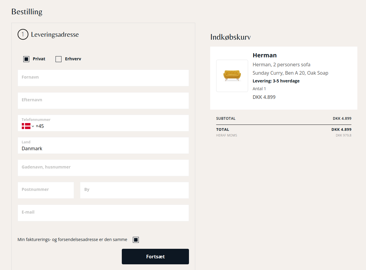
When you go to the checkout page, you can see a cart summary, add your delivery information, and choose a delivery method. Customers can choose between a curbside pickup, pickup from the warehouse, or getting the product delivered to their address.
The overall shopping experience on the Sofacompany website is clean and pleasant. Rich e-commerce merchandising features such as 360-degree views, augmented reality, and 4K zoom make online shopping engaging. There is great consistency in the visuals and buyer journey across devices, which makes customers confident when making a purchase.
2. FEST
FEST is a Dutch interior brand that offers affordable, high-end design and the best possible service without the high-end price tag. The brand is known for its comfortable and stylish made-to-order sofas with minimalist designs and contemporary finishes.
In our Top 50 DTC Furniture Brands report, FEST has the second-highest digital merchandising index (87). The results from our research show that FEST has all the analyzed features except product reviews.
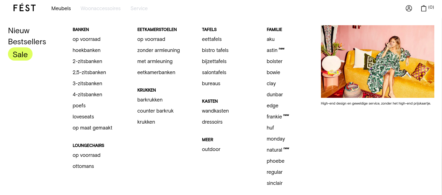
On the homepage, there is a navigation bar with a drop-down menu that opens on hover. When browsing on mobile, you’ll notice a hamburger menu in the top left corner where you can choose product categories.
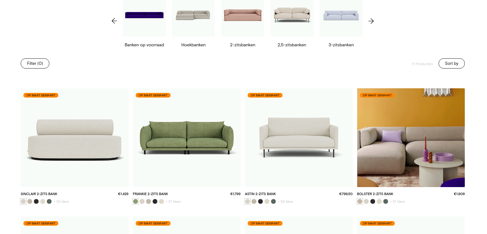
Once you select the product category, you can see thumbnail images for different products. Under each image, there is information about the price as well as color options that you can choose from and get a thumbnail preview without entering the product detail page.
Besides this, there are plenty of filtering options on the product feed. You can filter products based on color, type, price, height, width, and depth. On the right side, you can sort products alphabetically, by price, or see the newest options and bestsellers.
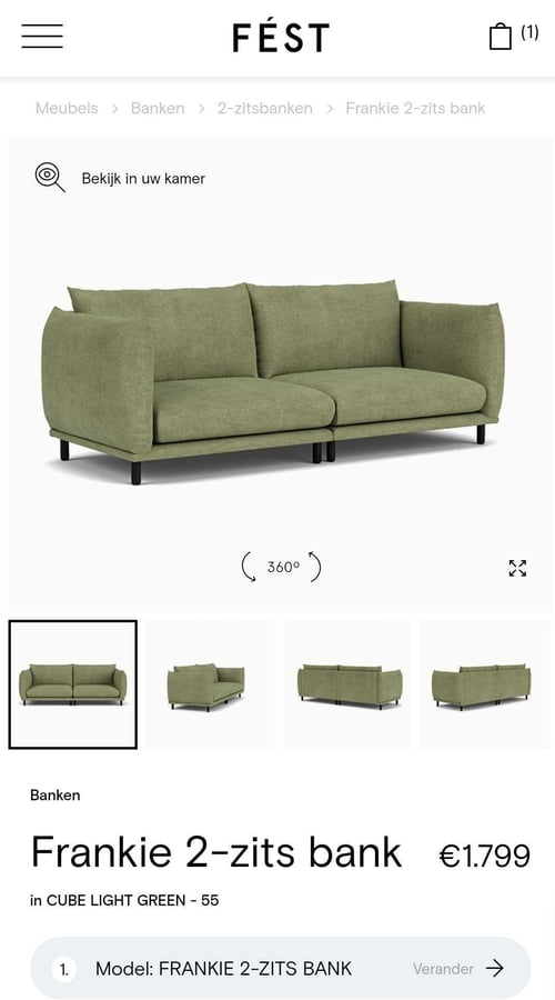
When you open the product detail page on the left, you can see a 360-degree view of the selected product and a 4K zoom. Below the 360-degree visual, there are multiple product images, including high-quality lifestyle visuals and alternate-angle images. The mobile experience with the 360-degree product configurator is equally pleasant and user-friendly.
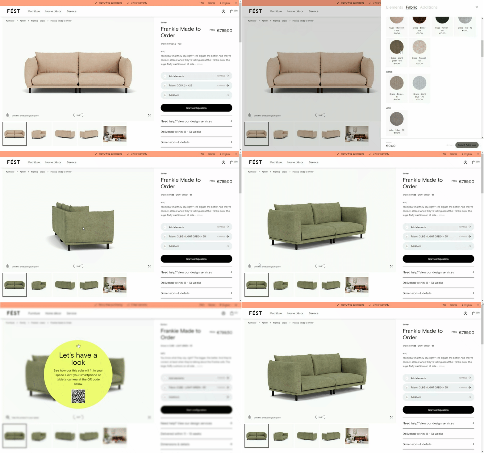
Customers can also explore the product using the full-screen mode or use the “view in your room” button to see how the product fits their home with the power of augmented reality. Depending on the device they are using, customers will get different experiences. By clicking the “view in your room” button, customers who browse through a desktop computer will get a QR code they can scan with their mobile phone to explore the product using augmented reality. This way, FEST creates a seamless experience powered by AR regardless of the device the customer is using.
At the bottom of the product page, customers can find different product recommendations tailored to their tastes.

Before the checkout, you can see the products in your shopping cart, the total price, the expected delivery date, as well as reminders for the financing and payment options.
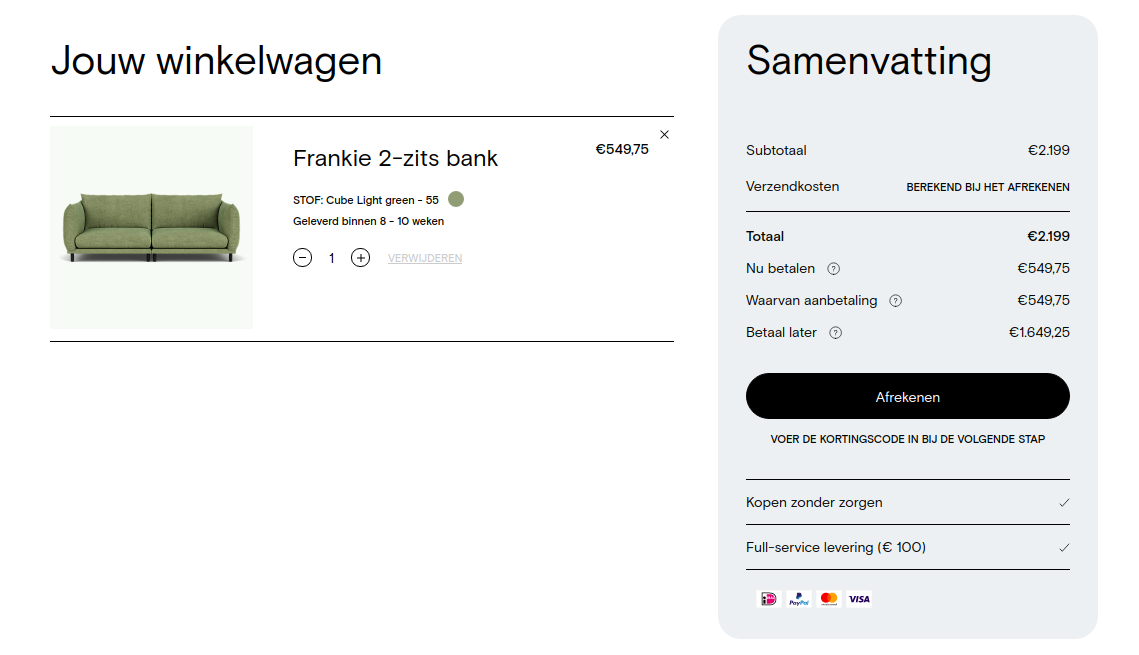
The overall experience on the FEST website is clean, pleasant, and engaging. The high-quality visuals and rich merchandising features make the shopping experience user-friendly and delightful. The mobile experience is well optimized and functional.
3. Interior Define
Interior Define is a digitally native furniture brand offering the most elevated and customized online furniture shopping experience. Since 2014, they have been delighting customers with customizable sofas available through their stunning website and Guideshops.
In our Top 50 DTC Furniture Brands report, Interior Define has the third-highest digital merchandising index (86.5). The results from our research show that Interior Define has all the analyzed features except product reviews.
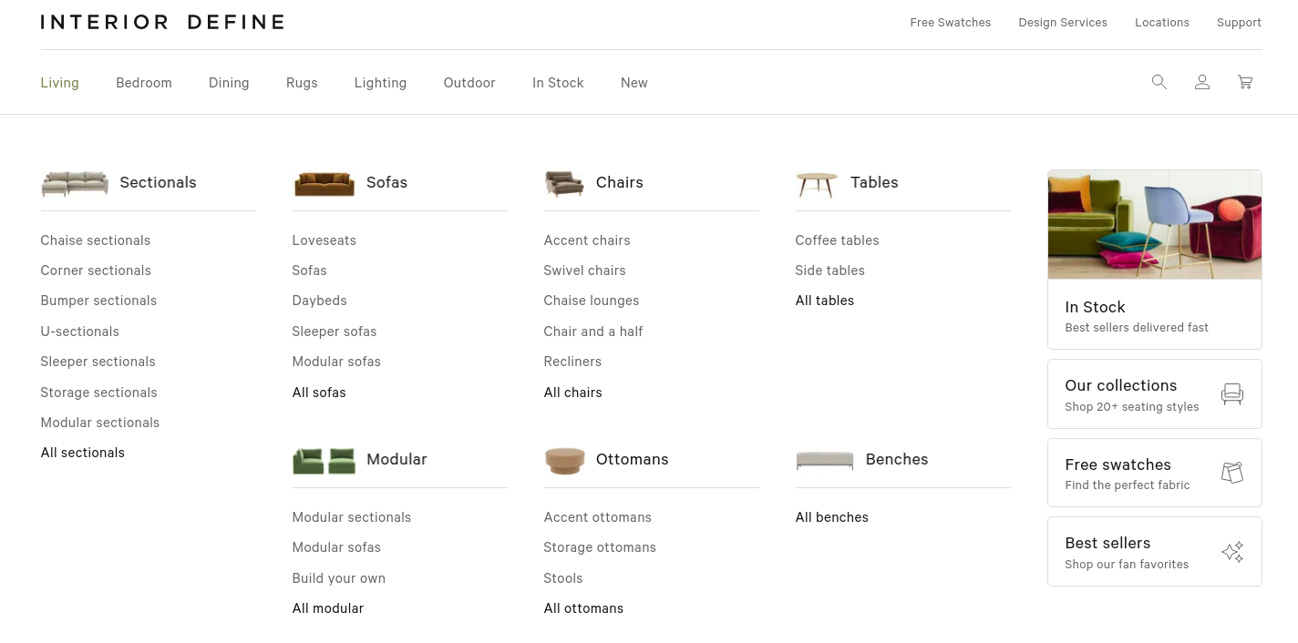
The first thing you notice when you open Interior Define’s website is a navigation bar with different product categories, each with a thumbnail image, to help customers find what they are looking for in just a few clicks.
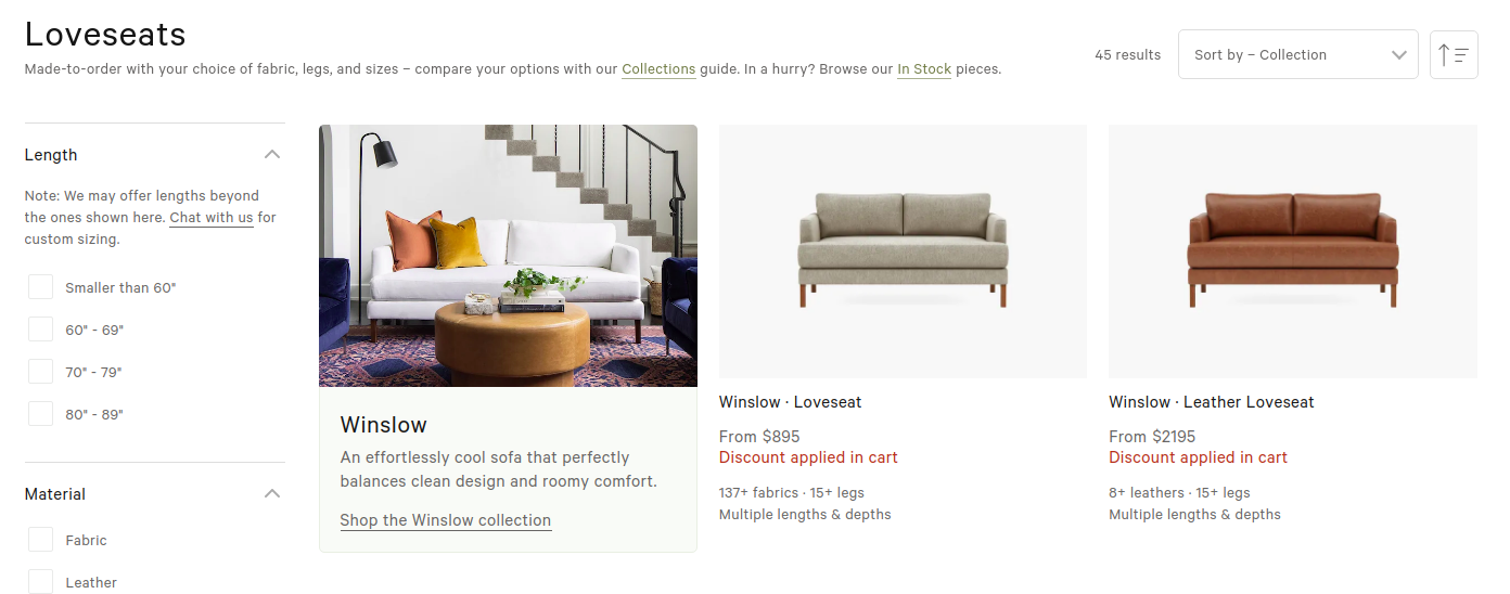
After you select a product category, you notice straightforward filtering options, where customers can pick the length, material, shape, and collection of the product. At the same time, under each thumbnail image, they have information about the number of fabrics and leg options for the particular product.
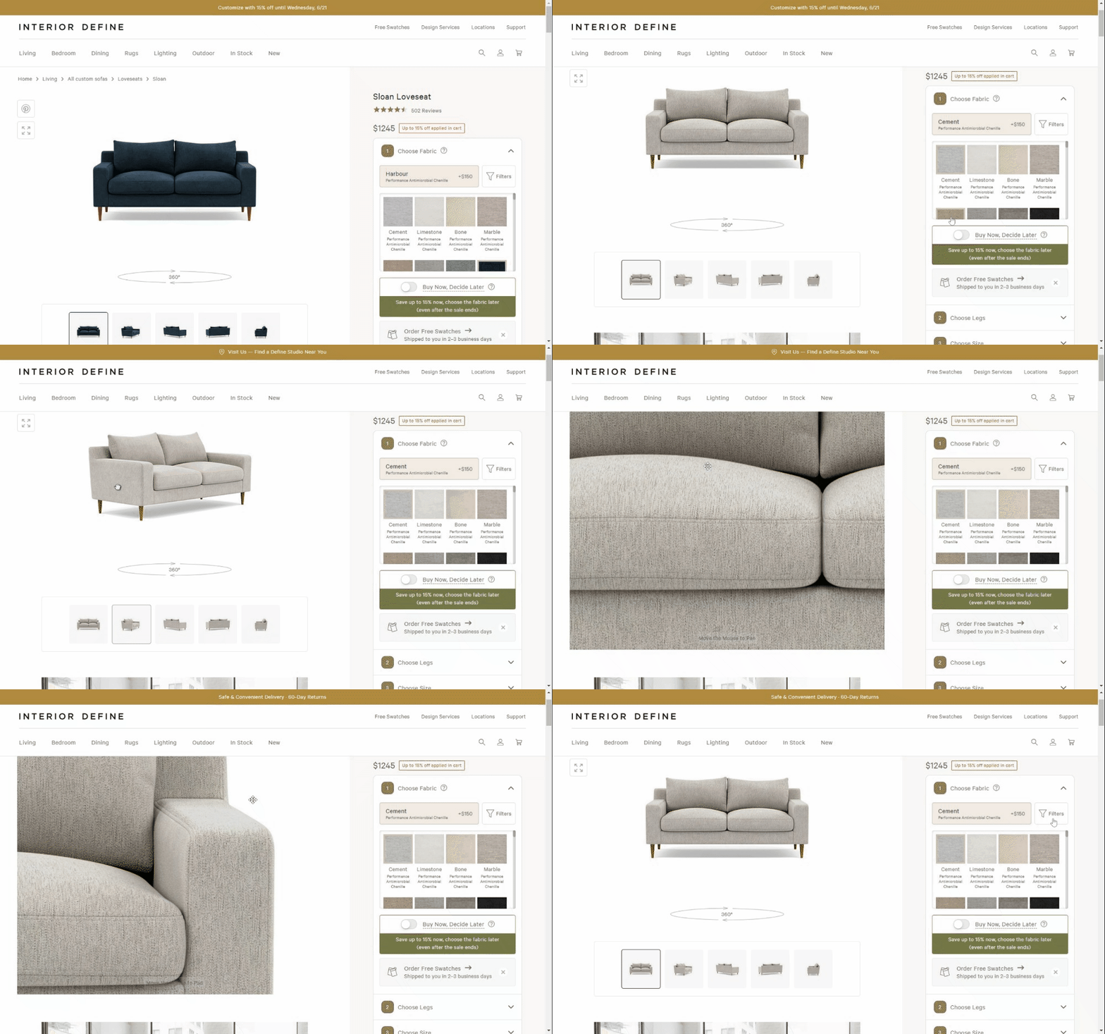
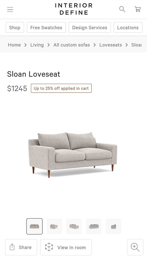
When you open the product detail page (PDP), on the left, you can see alternate angles, zoom in to scrutinize details, or get a 360-degree view of the selected product. Besides the click-to-zoom feature, Interior Define has a full-screen mode where customers can zoom in on the details.
Another best practice with a 360-degree view is to indicate its presence on the PDP. This is especially important for your mobile browsing experience. Interior Define solves this with an arrow circle illustration. On the right side, there is a 3D product configurator where customers can select the fabric, legs, depth, size, cushions, etc.
When customers open Interior Define’s website on mobile, they can also click the “view in room” button and visualize the product in their home using augmented reality straight through the browser without the need to download an app, which removes friction and creates a smooth and seamless customer experience.
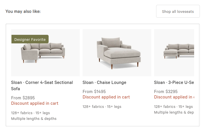
At the bottom of the product page, there is a recommendation section with designer favorites, including the most important product details like price, number of fabrics, and leg options.
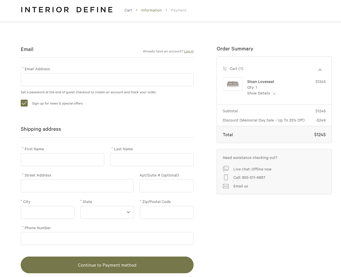
Interior Define uses cart thumbnails in the exact color the customer has chosen, which decreases the number of product returns. On the checkout page, customers fill in the shipping information and payment information. The last step is an order confirmation.
The overall shopping experience on the Interior Define website is pleasant, simple, and straightforward. With great design and seamless user experience, the website creates a great flow through the purchasing funnel. Customers have all the information needed to make a buying decision, and the user journey is fully optimized from start to finish.
Get the full report
DTC brands have been at the forefront of innovation in the furniture industry. To find out what makes their experience so compelling for customers, we’ve dissected the online shopping experience of the Top 50 DTC Furniture Brands. The findings are just a click away!

