The consumer shift toward e-commerce has opened the door for a long-overdue great retail reset and digital transformation with the ultimate goal of creating a seamless omnichannel shopping experience.
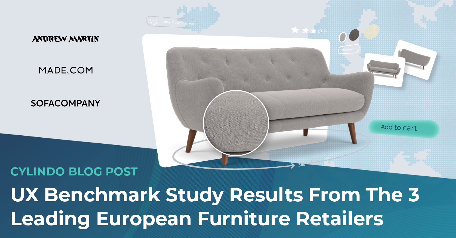
To understand the elements of an effective online furniture shopping experience, we dissect the online buyer journey of the three companies from our Top 100 European Furniture Retailers report that have the highest ranking based on the number of adopted features and quality of product visuals.
1. Andrew Martin
Andrew Martin has been at the forefront of global design since 1978. Its aesthetic is a rich mix of elements, reflecting a global assortment of influences. The luxury brand is well-known for its creative designs in furniture and home accessories. Its philosophy is to provide simple yet innovative designs with global inspiration using distinctive colors and textured fabrics.
In our Top 100 European Furniture Retailers report, Andrew Martin ranks first with the highest e-commerce merchandising index (89.5). The results from our research show that Andrew Martin has all the analyzed features and high-quality visuals.
The first thing you notice when you open Andrew Martin’s website is a navigation bar with different product categories that customers can explore to find what they need. If you’re browsing on mobile, you’ll notice a hamburger menu in the top left corner where you can go through product categories.

Once you select the product category, you’ll see the product feed with lifestyle imagery of different products. Below the product thumbnails, you can see additional price information and a number of fabrics available.
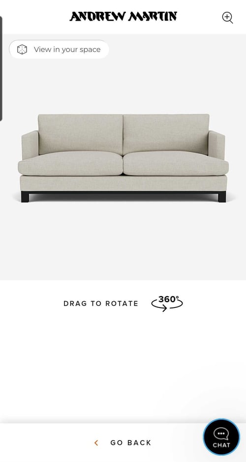
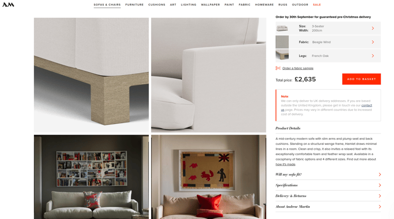
When you open the product detail page (PDP), you can see alternate angles, zoom in to scrutinize details, and get a 360-degree view of the selected product. Customers can also customize the size, fabrics, and legs of the products by clicking on the buttons on the right.
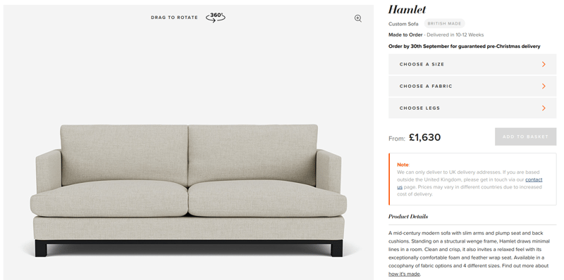
If you’re browsing on mobile, you can see a carousel with different product visuals, alternate angle images, detail shots, and lifestyle imagery. Below the carousel, there is a “View in 360” button, where customers can explore the product using a 360-degree viewer and 4K HD zoom to scrutinize the details.
Another feature customers can enjoy while browsing from their mobile devices is the “View in your space” button, which allows customers to visualize the product in their home using augmented reality without downloading an app.
Below the product configuration options, customers can see information about the price and an add-to-cart button, as well as an option to order fabric samples. Besides this, there are detailed descriptions, product specifications, and transparent delivery and returns policies that customers can see, even before adding the product to the cart.
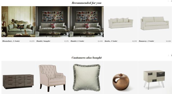
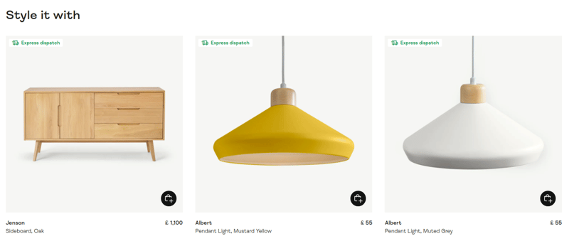
At the bottom of the product page, there is a recommendation section where customers can see personalized recommendations, as well as products other customers bought.
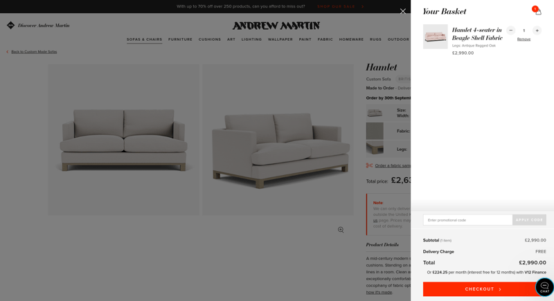
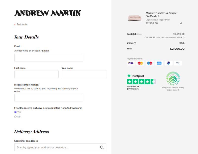
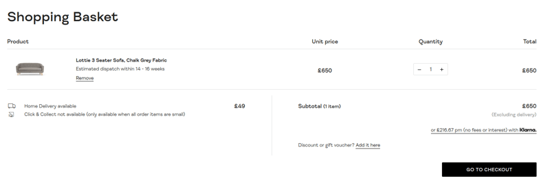
Before checkout, you can see all the products in your shopping cart, the total price, delivery costs, as well as reminders for affordable financing. Andrew Martin uses cart thumbnails in the exact color the customer has chosen, which decreases the number of product returns. Removing products from the cart is simple and straightforward. Alternatively, you can change the quantity by clicking on the counter.
On the checkout page, customers fill in personal information and delivery address. During the checkout process, customers can see the total price, available payment options, TrustPilot score, and a Rewards.Earth badge, letting customers know they plant a tree for every order placed.
The overall shopping experience on the Andrew Martin website is pleasant, simple, and straightforward. With great design and seamless user experience, the website creates a great flow through the purchasing funnel. Customers have all the information needed to make a buying decision, and the user journey is fully optimized from start to finish.
2. Made.com
The U.K. online furniture retailer Made.com launched over a decade ago with the mission to make great design available to everyone. The founders believe that customers shouldn't have to compromise between great design, high quality, and affordable prices.
In our Top 100 European Furniture Retailers report, Made.com has the second-highest digital merchandising index (89). The results from our research show that Made.com has all the analyzed features and high-quality product visuals.
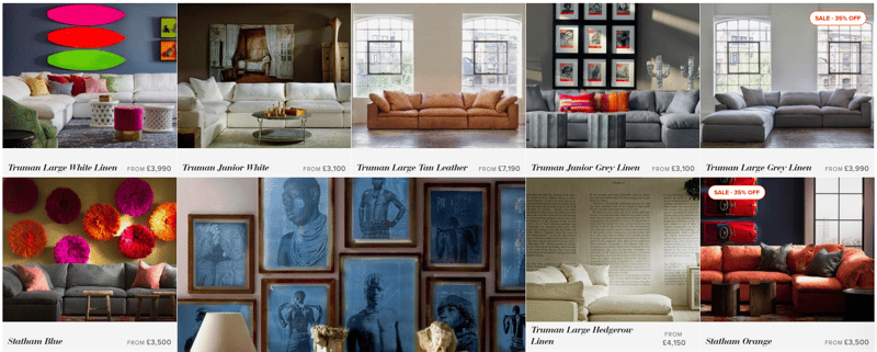
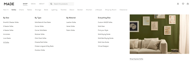
On the homepage, there is a navigation bar with a drop-down menu that opens on hover. When browsing on mobile, you’ll notice a hamburger menu in the top left corner where you can choose product categories — each of them represented with a thumbnail image.
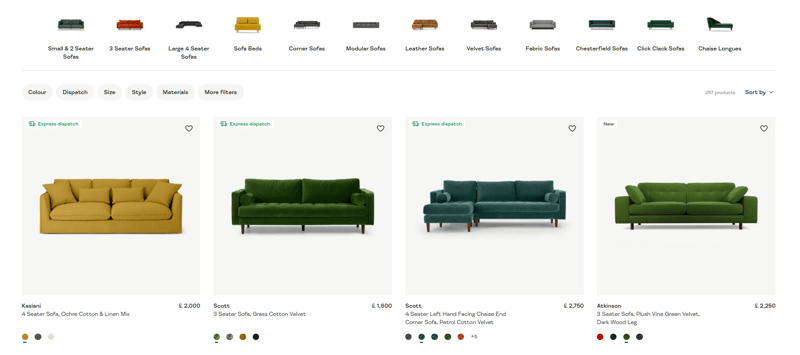
On the product feed, you can see thumbnail images for different products. Under each image, there is information about the price as well as color options that you can choose from, and you can get a thumbnail preview without entering the product detail page. For most products, customers can also see a lifestyle image on hover.
Customers can also select a different product category by clicking on the filter represented with thumbnail images at the top of the page.
Besides category filters, there are many other filtering options like color, dispatch, size, style, materials, etc. On the right side, you can choose whether you want to see Made’s picks, newest additions, or filter products depending on the price, dispatch time, or in alphabetical order.
When you open the product detail page, you can see different product images, videos, lifestyle images, and detail shots — stacked vertically on the left side. On the right side, you can see the price, a product configurator with available colors, and information about delivery price, dispatch time, warranty Information, and dimensions and details. The 360-degree dimensions view and AR are below the fold, which makes it difficult to navigate.
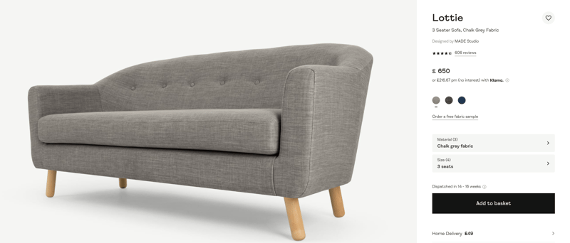
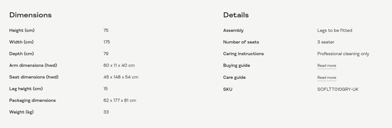
Below the configurator, the customer can get more information like product description, dimensions, assembly information, care instructions, etc.
Made.com encourages customers to mention @madedotcom in the photos they share on social media, and the retailer features the best pictures on its website.
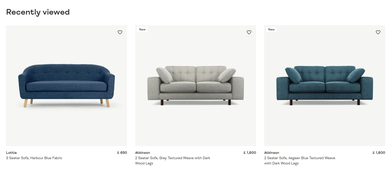
At the bottom of the product page, there’s a recommendation section with recently viewed products and products other customers are checking out.
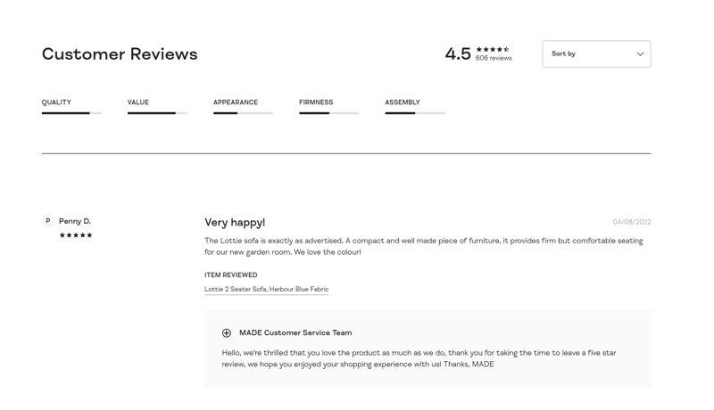
You can also see customer reviews that can be sorted by rating and date. For each product, Made.com shows an average assessment for quality, value, appearance, firmness, and assembly.
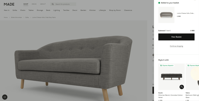
When you click the “add to basket” button, there is a pop-up with a thumbnail image of the product, total price, and option to view the basket or continue shopping. There are also recommendations for products that go well with the selected sofa.
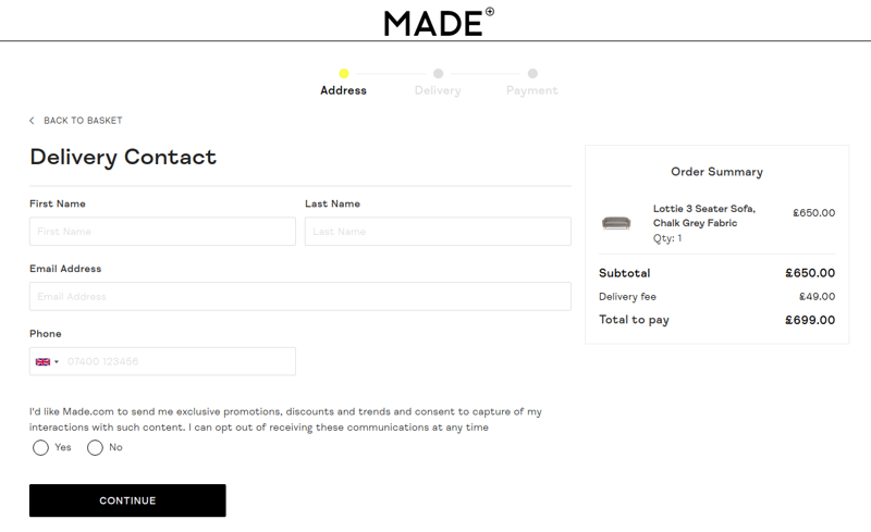
Before checkout, the customer gets an overview of the most important information, such as price, quantity, delivery information, and their “buy now, pay later” option. At the bottom, there’s a section with related products.
When you click the “checkout” button, there’s a sign-in pop-up for returning customers; alternatively, the customer can choose a guest checkout.
If you choose the guest checkout, you’ll see a three-step process where you fill in the address, delivery, and payment information.
The overall shopping experience on the Made.com website is clean and pleasant. There is room for improvement in the arrangement of elements on the product page so that engaging features such as 360-degree views can be more easily accessible.
3. Sofacompany
Sofacompany is an online-first retailer on a mission to challenge the furniture industry by making high-quality Danish design available to all. What makes Sofacompany so special is the delightful end-to-end customer journey across channels.
In our Top 100 European Furniture Retailers report, Sofacompany has the third-highest digital merchandising index (88.5). The results from our research show that Sofacompany has all the analyzed features except product videos. The product pages are rich with high-quality visuals.
On the homepage, there is a navigation bar with a drop-down menu that opens on hover. When browsing on mobile, you’ll notice a hamburger menu in the top left corner where you can choose product categories.
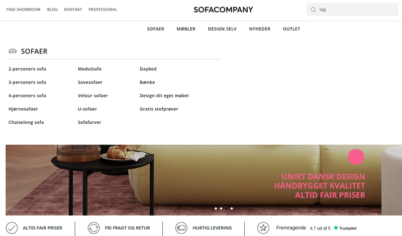
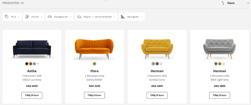
Once you select the product category, you can see thumbnail images for different products. There is information about the price and different product colors under each image. Besides this, you’ll see different filtering options: price, color, designer, and right/left facing.
On the right side, you can choose whether you want to see the most popular or newest or filter products, depending on the name, price, or which side they are facing.
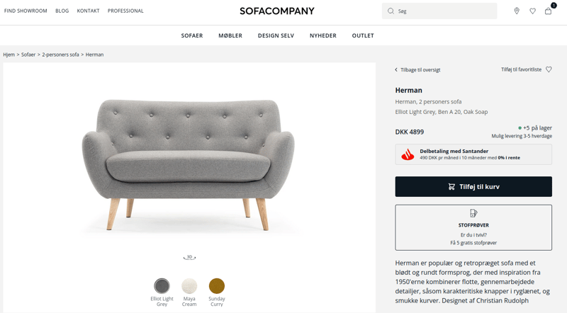
When you open the product detail page, there is a main visual with thumbnail images below the alternate angles and detail shots. Customers can also get a full-screen mode and a zoom option. On the right, you’ll see price information and a “design yourself” button that leads customers to the product configurator.
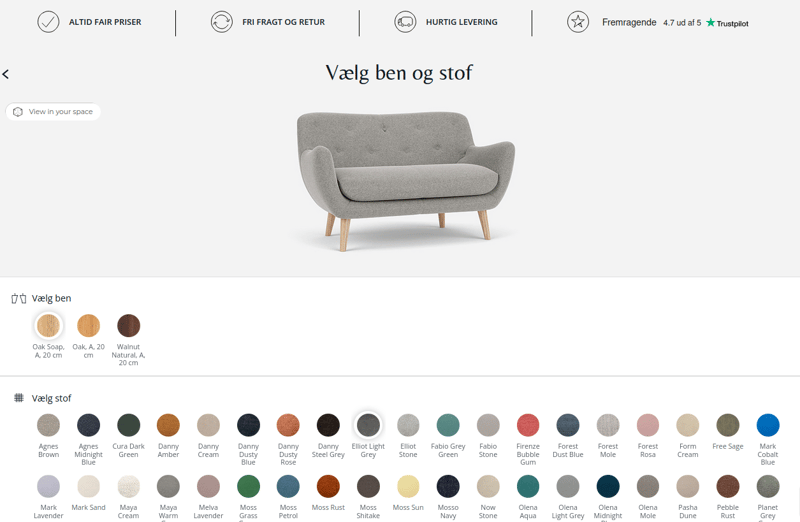
Using 3D product configurator software, customers can choose from a wide range of materials with different colors, patterns, and textures, as well as leg options. What’s more, there is an engaging 360-degree viewer and 4K HD zoom that lets customers scrutinize the details.
The mobile experience with the 360-degree product configurator is equally pleasant and user-friendly.
Back on the product detail page, there is information about possible delivery, showrooms where you can find the product you’re looking for, and free fabric samples.
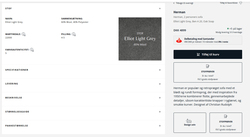
Below the fold, you can get more information like product description, dimensions, fabric details, and package dimensions.
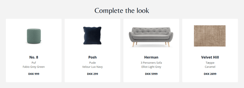
At the bottom of the product page, there is a recommendation section based on complementary products to complete the look.
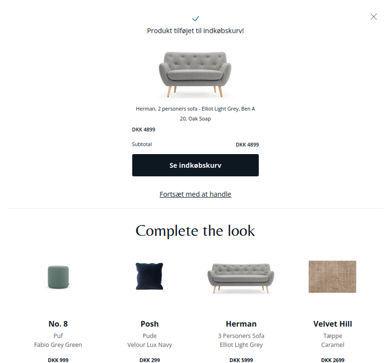
When you click the “add to basket” button, there is a pop-up with a thumbnail image of the product, the total price, and the option to check out or continue shopping. Below the checkout information, there are product recommendations.
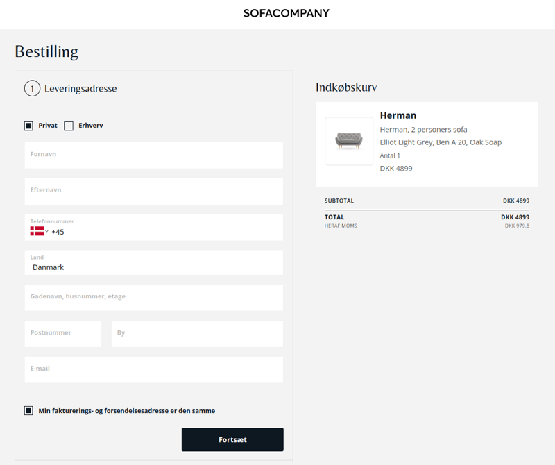
When you go to the checkout page, you can see a cart summary, add your delivery information, and choose a delivery method. Customers can choose between a curbside pickup, pickup from the warehouse, or getting the product delivered to their address.
The overall shopping experience on the Sofacompany website is clean, pleasant, and engaging. There is great consistency in the visuals and buyer journey across devices, which makes customers confident when making a purchase.
Next step
Ready to explore the benefits of 3D product visualization technology and how it can help you create an engaging furniture shopping experience?