Key points:
-
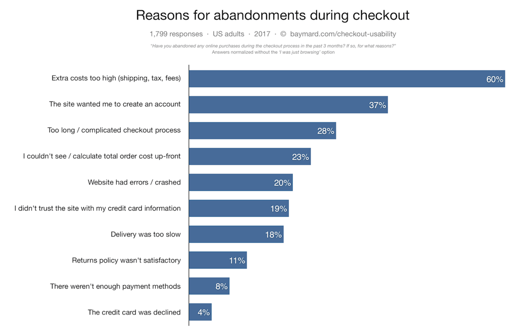
UX is the Primary Driver of Abandonment: With retail cart abandonment rates sitting at 75.6%, the data indicates that bad user experience is the root cause; specifically, extra costs, forced account creation, and complicated checkouts are the top reasons shoppers drop out.
-
High-Quality Visuals are Non-Negotiable for Reassurance: Product visualization is the "abandonment killer" because it delivers inspiration and engagement; features like high-definition zoom are rated as the #1 most valued tool for furniture merchandising, scoring 75.9 points for effectiveness.
-
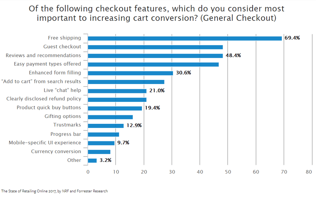
Simplified Checkouts Directly Increase Conversions: Friction at the final step is a major deterrent, as 48% of shoppers state that the availability of guest checkout positively influences their decision to complete a purchase.
Online shopping cart abandonment rates vary from 50% to 80% depending on the industry.
According to Statista, the abandonment rate in retail for the first quarter of 2018 was 75.6%. In other words, ¾ of customers who add products to their carts drop out before they complete the checkout process.
Even though cart abandonment is somewhat of a natural thing for most e-commerce sites, there are still some things that are under your control. With minor fixes, you can significantly decrease this rate.
Start with "Why"
So what is the main reason for cart abandonment? Why are visitors leaving your website? The answer is quite simple: Bad user experience. Research from Adobe shows that customers who have an unpleasant experience on your website are 88% less likely to return to it.
Analyzing your shopping cart abandonment rates is the best starting point toward improving UX.
 According to Baymard, extra costs, forced account creation, and complicated checkout processes are the primary drivers of abandonment.
It’s important to know that higher traffic doesn’t necessarily mean a higher conversion rate. If you don’t work on your UX before attracting more visitors, your bounce rate will explode, and you risk negative word of mouth.
Know Your Customer
Remember the 80/20 rule: 20% of your customers represent 80% of your sales. Find your best customers and provide the excellent customer journey they seek.
Obvious Always Wins
When it comes to eCommerce UX, less is more. Today’s consumers don’t want to spend hours browsing for information.
-
Pave the way to the “Add to Cart” button: Make your C2A as clear as possible to avoid clutter and confusion.
-
Navigation is crucial: Help customers find what they are looking for so they don't visit a competitor.
-
Optimize for searchers and browsers: Cater to those who know exactly what they want and those who want to explore.

"First, focus on making your visitors feel confident and secure enough to make a purchasing decision. Help them find the 'right' product and boost their confidence with social proof. It’s all about trust."- Kristian Sørensen, Lead UX Front-end Engineer, Cylindo
▶️Download: Six Trends That Will Shape Furniture & Visual Commerce in 2026
See how leading furniture brands win in 2026 with AI content, rich PDP visualization, and real-time configuration.
Need for Speed
Users form an opinion about a brand within two-tenths of a second. According to Soasta, digital customer experience is dictated by performance:
-
50% of unsatisfied visitors will go to a competitor
-
35% will have a negative perception of the brand
-
22% will never return to a slow site.
Stories Tell, Visuals Sell
People would rather engage with visual elements than read a detailed product description. You have to show more to sell more.
We live in a world of instant gratification. Customers have the power to choose, and it’s easier than ever to switch brands.

“On the product page, the first job of imagery is to deliver inspiration... your next job is to prompt engagement... finally, use imagery to deliver reassurance. Answer as many questions as you can through imagery to give them the confidence to click the add to basket button” -David Kohn, Customer and E-commerce Director, Heal’s
Why Furniture Visuals are the "Abandonment Killer":
-
Quantity and Quality: Salsify found that products with more images and videos convert more, even at higher price points.
-
The Power of Zoom: Retailers perceive the zoom function as one of the ten most valued features. With 75.9 points, zoom was voted the #1 feature for rich furniture merchandising.

Source: NRF
-
Context Matters: 78% of online shoppers want products brought to life with images.
-
Interactive Engagement: 360-spin and AR/VR technologies result in increased conversion rates by letting users "play" with the product.
Simple Checkout Experience
Long and complicated checkout processes are the #3 reason for cart abandonment (28%). When you add the users who drop out because they don’t want to create an account (37%), the checkout becomes the most critical point of the journey.
-
Enable Guest Checkout: More than 48% of respondents answered that guest checkout positively influences their buying decision.
-
Visual Confirmation: Show an image of the specific product configuration in the shopping cart to avoid confusion and reduce returns.
-
Incentivize Registration: Offer a personalized experience or incentive rather than forcing a wall between the customer and the purchase.
What does the Future Hold?
Product page UX is evolving. The introduction of conversational UX, voice search, and barcodes will change the customer journey forever.
Tired of losing 3 out of 4 customers at the checkout?
Fix your product page UX where it matters most. Contact us today to reduce cart abandonment and increase conversions with superior 3D product visualization software.


