
Europe is well-known for its long furniture manufacturing history. The unique style of European brands gives them a competitive edge, especially in the high-end segment of the furniture market.
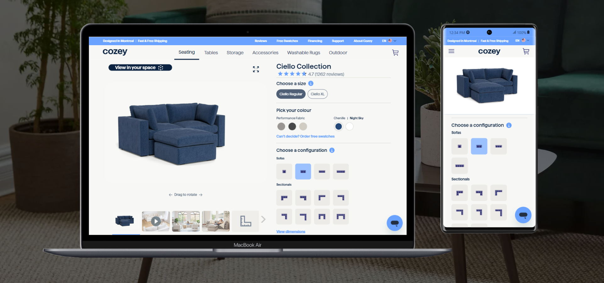
To understand the elements of an effective furniture website experience, we dissected the websites of the three companies from our Top 100 European Furniture Brands report that have the highest ranking based on the number of adopted features and quality of product visuals.
1. Muuto
Muuto is rooted in the Scandinavian design tradition characterized by enduring aesthetics, functionality, craftsmanship, and an honest expression. The combination of forward-looking materials, techniques, and bold creative thinking enables them to deliver new perspectives on Scandinavian design. In fact, the brand name, Muuto, comes from muutos, meaning new perspective in Finnish.
In our Top 100 European Furniture Brands report, Muuto ranks first, with the highest website experience index (94).
When you open Muuto’s website, you notice three sections at the top: products, designers, and stories. There is also a separate section for professionals.
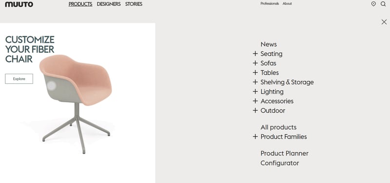
When you click the products section in the navigation bar, there’s a drop-down menu. Alongside the different product categories there, Muuto also highlights the product planner and configurator. Muuto’s product configurator allows customers to get playful and explore more than 100,000 combinations of colors alongside textile and leather upholsteries across their entire range of sofas as well as selected chairs and tables.
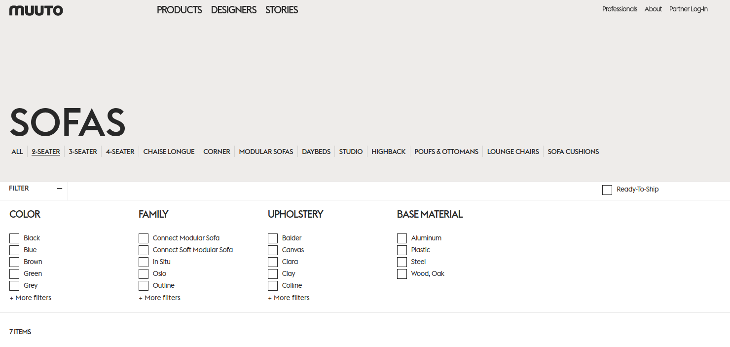
Once you select a category, you see a product feed with high-quality thumbnail visuals. There are straightforward filtering options where customers can pick color, family, upholstery, and base material. Customers can even choose the ready-to-ship field and browse only through those products.
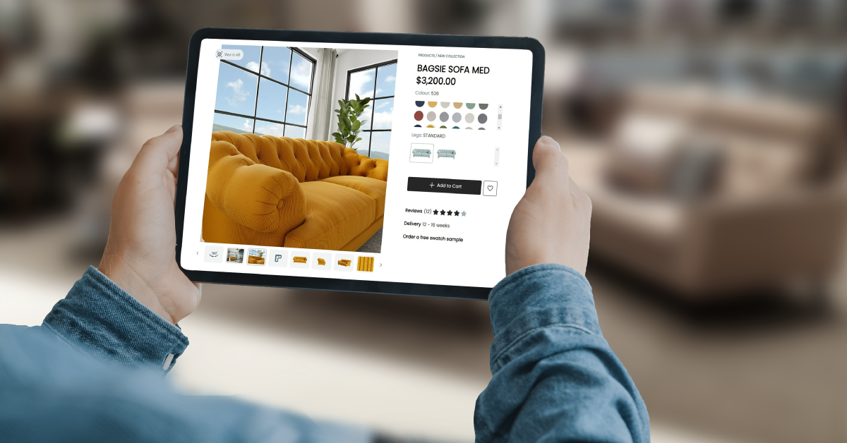
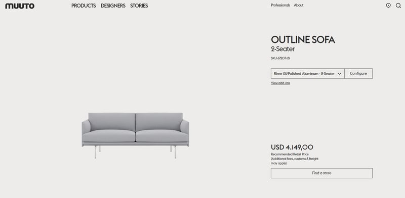
When you open the product detail page (PDP) at the top, you see a product visual, product information details, recommended retail price, and a “find a store” button.
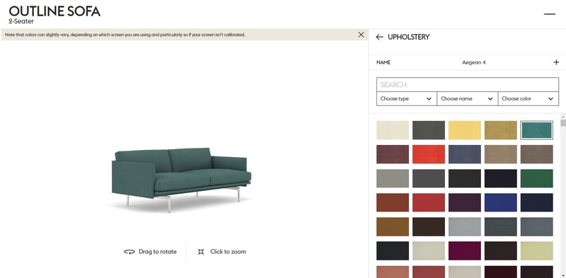
On the right side, there’s information about the product, ready-to-ship product variations, as well as made-to-order inspiration. When you click the “configure” button, there’s a pop-up window where you can explore the product in a 360-degree view, zoom in on the details, and configure the base color and the upholstery.
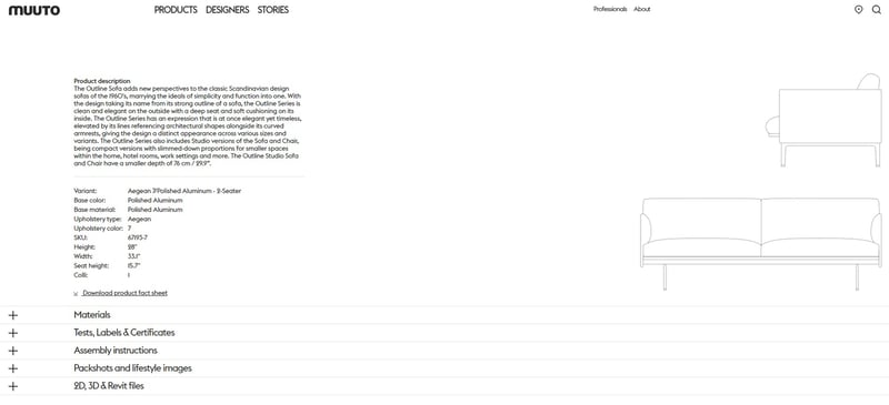
Below, there’s a library with product information about materials, tests, labels and certificates, and assembly instructions. In this section, you can also find packshots, lifestyle images, 2D, 3D, and Revit files available for download.
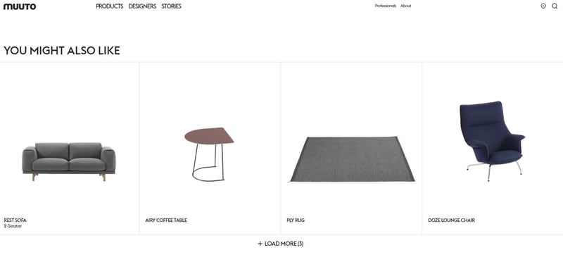
The bottom of the product page features product recommendations with related products, as well as a “meet the designer” section.
Muuto is a great example that a furniture brand can create a pleasant website experience for different audiences — from design trade professionals and business buyers to end customers. With great design and seamless user experience, Muuto’s website creates a great flow and a fully optimized user journey from start to finish.
2. Montana Furniture
Montana Furniture is a family-owned company, established in 1982, leading in storage and furniture for private homes and contemporary office spaces. All Montana modules are designed, developed, and made in Denmark. They work hard to uphold the highest standards of processing, painting, and assembling — making sure that Montana furniture will last a lifetime.
In our Top 100 European Furniture Brands report, Montana Furniture has the second-highest website experience index (91.5).
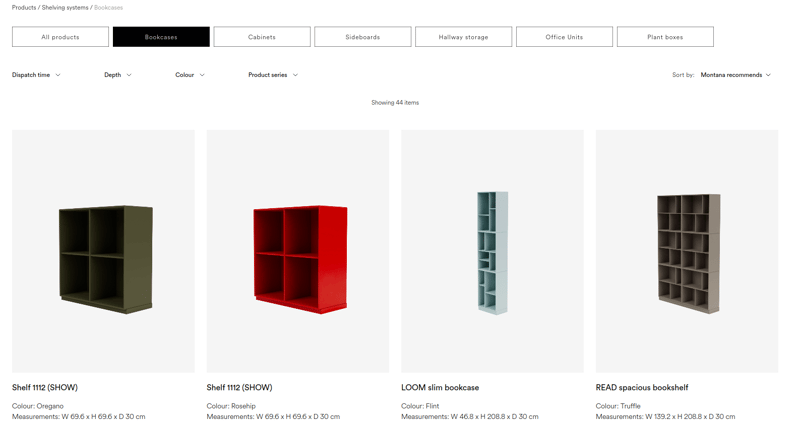
On the home page, there is a navigation bar with a drop-down menu on hover. When you enter a product feed, you can see thumbnail images for different products with color and dimension information.
Besides category filters, there are many other filtering options like dispatch time, depth, width, color, material, and product series. On the right side, you can choose whether you want to see Montana recommendations, filter products depending on the price, check the newest products, or browse alphabetically.
When you open the product detail page, you can see the product in a 360-degree view and zoom in on the product and scrutinize details in full screen. Besides this feature, a manually controlled carousel shows product images from different angles. On the left side, the visitor can configure the selected product by choosing different colors, positions, and depths.
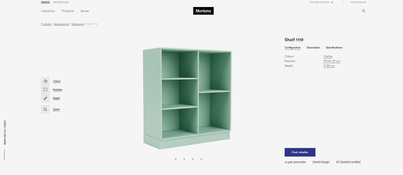
On the right side, you can see product information about the selected configuration, description, and specifications. If you’re interested in buying the product, you can navigate to the list of retailers on the right of the product details page by clicking on the “find retailer” button.
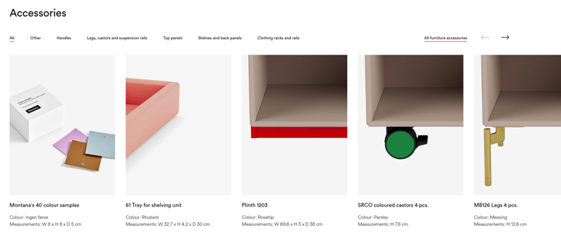
Moving down the product page, you can find a section with related accessories, including thumbnail images, color, and dimension information.
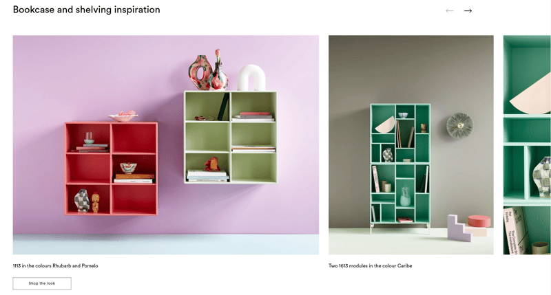
Montana has a section with impeccable room scenes to inspire customers and enable them to shop the look with a click.
There’s also a section with detailed product information, as well as 3D files, a catalog, and a maintenance guide available for download.
The overall experience on Montana’s website is clean and pleasant. The website has a simple and straightforward navigation. Features like 360-spin, a product configurator, HD zoom, and related products enrich the website experience, keeping the visitor engaged. The mobile design is well thought out, with a fast page load speed, especially when interacting with the product configurator.
3. Neptune
Neptune is a British interior and lifestyle brand that designs and makes furniture, lighting, and accessories for the whole home. With a mindset of challenging convention and looking at things differently, they’re often reviewing things they’ve done and reassessing whether they’re still good enough. Innovative thinking is part of their DNA, and it extends to how their designs can be used.
In our Top 100 European Furniture Brands report, Neptune has the third-highest website experience index (90.5).
When you enter the home page, you notice a navigation bar with a drop-down menu. For each product category, there are different subcategories. At the bottom of the navigation bar, there is a section where visitors can browse products alphabetically.
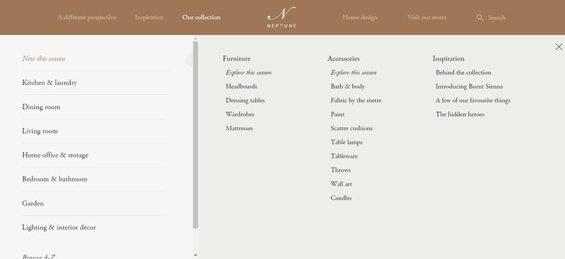
When browsing on mobile, you’ll notice a hamburger menu on the top left corner where you can choose product categories.
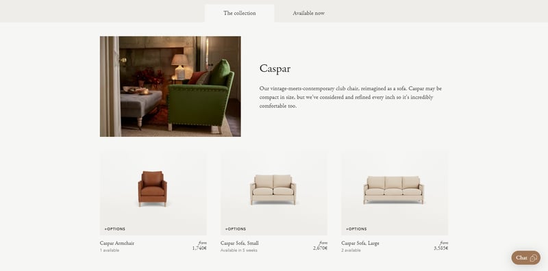
After selecting a product category, you will notice two sections: in the first one, “the collection,” you can find all the products from the collection in the chosen product category. In the second section, “available now,” you can only find products that are available right away.
When you open the product detail page (PDP), you can see high-quality lifestyle images, alternate angle images, and detail shots on the left. On the right side, visitors can use the product configurator to customize the product with different fabric, leg colors, and other details. Thanks to the high-quality product visualization, you can get a 360-degree view of the selected product and zoom in to scrutinize details.
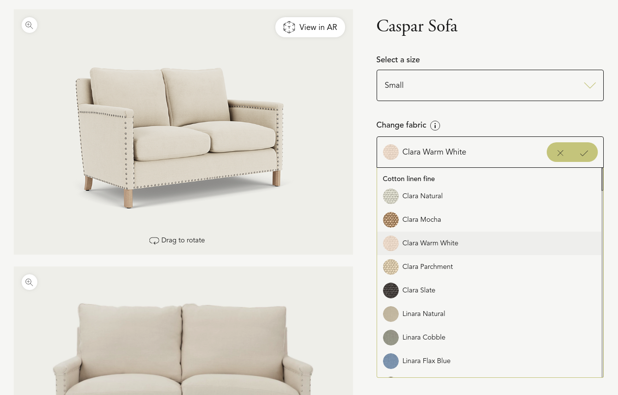
Customers can also check out the product in augmented reality. If you’re browsing on desktop, by clicking the “view in AR button,” you are prompted to scan an AR code and seamlessly transition from desktop to mobile.
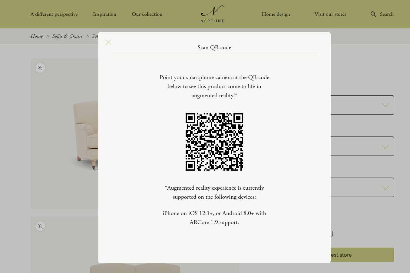
Another interesting feature is when you open the drop-down menu to configure the fabric, you can see information about the price and also when the product in that specific fabric will be available. The recent supply chain issues influenced the delivery time, so being transparent and setting accurate expectations is always the best solution.
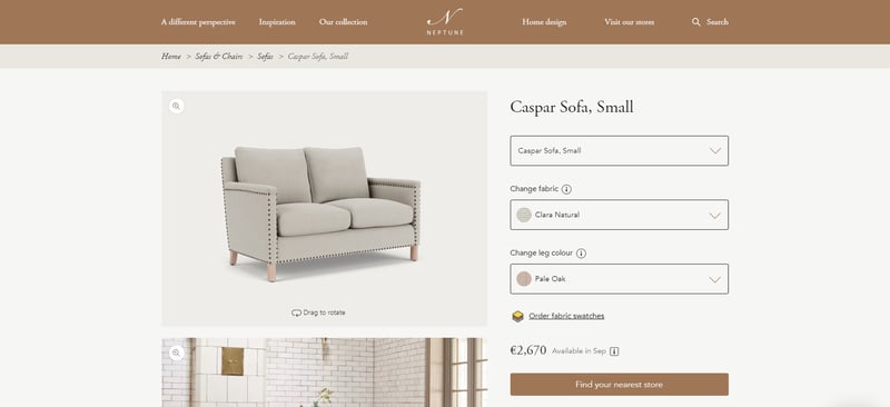
Below the product configuration, there’s information about price, design, engineering, technical details, and delivery and returns information. To help visitors find the product easier, there’s a “find your nearest store” button on the product details page.
The overall website experience on Neptune’s website is clean and pleasant. The page load speed is excellent, and the website is well optimized for mobile devices. Despite being a furniture manufacturer, the attention to detail distinguishes Neptune from traditional furniture brands that don’t invest a lot of time and effort in their website experience.
Next step
To find out the final ranking of the Top 100 European Furniture Brands for 2022, download our report. Packed with analysis of the must-have website features, assessment of product visuals quality, best practices, and expert opinions, you're going to love this one.
Ready to explore the benefits of 3D product visualization technology and how it can help you create an engaging furniture website experience?