Key Points:
-
Email Marketing is Highly Effective and Essential for Furniture Retail: Despite its age, email is a top-performing marketing channel, generating $36 for every dollar spent. In the home furnishings industry, email flows see a high average open rate of 54%. Given that furniture is a big-ticket item requiring multiple customer touchpoints, email is crucial for communicating value and driving conversions.
-
Visual Content is the Key Driver for Email Engagement: A core lesson from leading furniture companies is the absolute necessity of high-quality visuals (as furniture is an incredibly visual industry). Image-based emails significantly outperform text-based ones. The solution to consistent content creation is leveraging 3D product visualization software to produce superior, photorealistic visuals and interactive elements like GIFs and 360-views for email campaigns.
-
Strategic Automation and Design Maximize Conversions: Leading brands maximize their email ROI by using strategic automation (like welcome emails and cart abandonment sequences to recover up to 79% of lost sales) and focusing on design. Key tactics include using catchy, non-clickbait subject lines, A/B testing different layouts, and using email to inspire customers with lifestyle shots and introduce new product features.
Email marketing remains one of the most effective and powerful tools available, making it a non-negotiable core component of any furniture business's wider marketing strategy.
👁️🗨️Quick trivia: The first email marketing blast was sent in 1978 by Gary Thuerk, who worked for Digital Equipment Corp. The email blast was sent to 400 recipients, and it generated $13 million in sales.
Fast forward to today, businesses still rely on email as one of the best ways to communicate with their customers. Why? Because it works! Data from Hubspot shows that email generates $36 for every dollar spent.
Today there are more than four billion email users, and this number is set to grow to 4.6 billion users in 2025. The good news: 77% of marketers have seen an increase in email engagement over the last 12 months.
The tricky part: standing out in a crowded inbox becomes harder by the day.
Furniture is a big-ticket item, and you need multiple touchpoints to convert modern-day furniture buyers. In other words, getting your customers’ attention across different channels is crucial.
When used right email can be a powerful tool in the hands of marketers. Data from Klaviyo shows that the average open rate of email flows in the home furnishings industry is 54%, with a 6.25% click rate, 1.75% conversion rate, and $3.19 revenue per recipient.
10 Email marketing lessons from leading furniture companies
As one of the most effective customer acquisition channels, email marketing can be a game-changer for your business. To help you step up your email marketing game, we’ve analyzed over 100 emails from leading furniture businesses. Buckle up! Here are the takeaways.
1. Use high-quality visuals
If there’s one thing in common for all the emails we’ve analyzed, it’s that leading furniture companies enrich emails with high-quality visuals. This is no surprise, as furniture is an incredibly visual industry.
High-quality product visualization is one of the key pillars of every successful furniture business.
*According to the Top 100 U.S. Furniture Retailers report, 45% have high-quality visuals on their product pages. This number goes up to 72% for DTC furniture businesses.
High-quality visuals also affect the performance of emails. According to GetResponse, image-based emails perform better — both in terms of the average open and click-through rates (CTR). Emails with images have 3.28% CTR (compared with 1.30% for text-based) and 24.25% open rate (compared with 15.55% for text-based).
When it comes to quality, there’s no room for compromise. If you want to convert more customers, you must use top-notch visuals.
This leaves furniture companies with a good-news, bad-news dilemma. On one hand, they know that high-quality product visuals are the key to more conversions; on the other hand, producing high-quality content consistently seems challenging.
The solution is advanced 3D product visualization software with superior visuals that can be leveraged across multiple touchpoints.
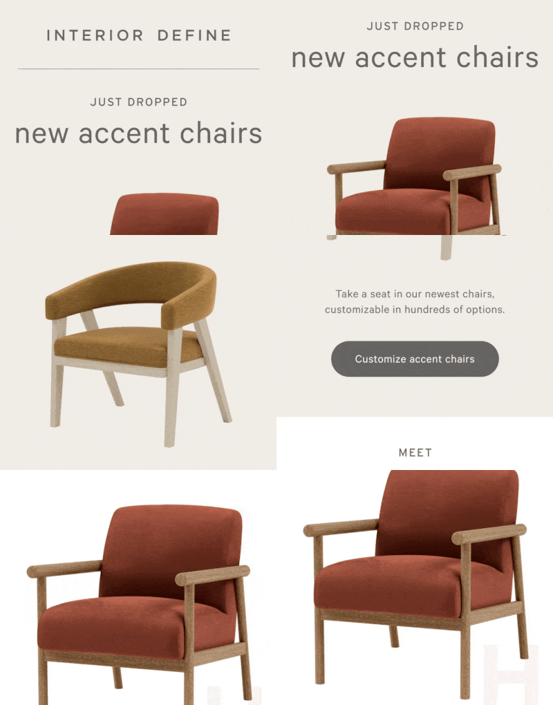
Case in point: Interior Define
The tech-savvy DTC furniture brand Interior Define sets new standards for furniture visualization. Besides rich product pages equipped with 360-views, a product configurator, and 4K zoom, they also incorporate high-quality product visuals in their email marketing campaigns.
2. Send a welcome email
Your sales personnel greets store visitors, right? Then why wouldn’t you greet email subscribers with a welcome email? Not only is that “by the book,” but it also works.
Data from GetResponse shows that almost seven out of 10 people will open a welcome email. The average click-through rate is 16.05%, which is more than 3x what you’ll see from regular newsletters.
When is the best time to send a welcome email? The first 48 hours are crucial. But it’s helpful to know that 74% of consumers expect a welcome message as soon as they subscribe.
Unfortunately, many businesses underestimate the value of building a relationship and setting expectations with an immediate welcome email. As reported by Keap, 41% of brands don't send a welcome email to new subscribers during that crucial 48-hour window.
By missing the shot with a welcome email, businesses also lose the chance to improve email deliverability — one of marketers’ biggest nightmares.
That’s right. A welcome email can help you land a customer’s inbox. You’ll get extra points for adding something click-worthy to your welcome email, such as a special offer, discount code, or personalized message.
Case in point: Joybird
The DTC furniture brand Joybird knows how to craft an effective welcome email. Besides highlighting the current discounts based on price ranges, they also notify subscribers of all the perks of their membership, such as VIP promotions and discounts, early access to exclusive sales, being among the first to know about new product launches, and getting the latest design tips and trends.

3. Reengage customers with cart abandonment email
Cart abandonment email is probably one of the most underrated marketing tactics for reengaging customers. While cart abandonment is normal in online shopping, not trying to convince customers to complete their purchase is a lost opportunity.
According to Baymard, the average online shopping cart abandonment rate is almost 70%. However, this number is significantly higher for the furniture industry. Data from Dynamic Yield shows the cart abandonment rate in the Home & Furniture category in September 2024 was at 79.67%.
Over the past twelve months, Home & Furniture has seen the highest shopping cart abandonment rate across different categories.
Now, this begs the question, what can furniture retailers do to reduce cart abandonment? While you can make many UX fixes to improve your eCommerce website experience, setting up an automated cart abandonment email can help you capture the low-hanging fruit.
Here’re some things to keep in mind:
- Don’t wait too long — According to Rejoiner, sending a follow-up email after one hour resulted in an average conversion rate of 16%. Sending the email too soon or waiting too long will have a negative impact on your conversion.
- Send a series of emails — — One email won’t cut it. Make sure to schedule a sequence of at least three emails. Send the first email one hour after abandonment, the second email the day after, and the third email three days after cart abandonment.
- Offer a discount — Almost 50% of shoppers abandon their shopping carts because of extra costs. Offering a discount can incentivize some of your visitors to return to their shopping cart and buy the item.
- Show a visual of the item in the cart — Just as showing the right cart thumbnail is important for the checkout, showing the product the customer has configured and added to the cart in the abandoned cart email can boost conversions. The good news is that now you can leverage those visuals programmatically, thanks to 3D product visualization.
Case in point: Article
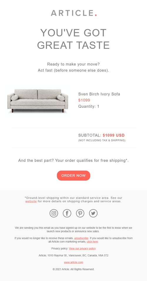
The Canadian DTC furniture disruptor Article has a catchy subject line: “Still thinking about this?” Once you open the email, you see a clean design focused on the item and price information. To urge customers to take action, Article reminds them about free shipping.
4. Play with email design
Email design is the process of strategically designing every aspect of an email to resonate with your recipients. From subject lines, layout, font, visuals, length, call-to-action buttons — everything goes under email design.
Even though almost every furniture retailer or a DTC brand has a brand book with specific guidelines it follows, there’s always room to play with different colors, structure, length, and visuals.
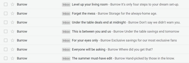
We’ll start with the subject line and pre-header text. If you don’t craft an attention-grabbing subject line, everything else goes to waste. Keep in mind that your subject line should be short, clear, and catchy. Make sure to provide value and give customers a reason to open your email. Last but not least, set the right expectations. Avoid clickbait subject lines at any cost.
Here’s how Burrow does it — using short and catchy subject lines that urge customers to open the email.
Another great way to improve your email design is to test different layouts, lengths, and elements. While creating a consistent brand identity is essential, minor tweaks in the email design can help you understand what your customers want and boost click rates.
The best way to see what works and what doesn’t is to use A/B testing for product imagery. However, when you experiment, change one thing at a time to connect the results with a specific experiment.
Case in point: Burrow
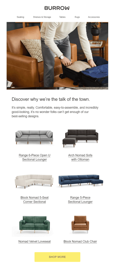
Burrow’s email design relies on interesting subject lines, clever copy, and clear structure. While there’s consistency and recognizable design, they use a variety of layouts, lengths, and elements such as social proof, new collections, and step-by-step shopping guides.
5. Use GIFs
Love it or hate it, GIFs have become a part of modern-day online communication. But should you use GIFs in emails? Sure! According to Litmus, 91% of consumers prefer interactive and visual content over traditional, text-based, or static media.
Now, we’re not talking about goofy GIFs that you share with your friends but rather GIFs that will help you represent your product in the best possible light: alternate angles, detail shots, 360-views, zoomed-in shots of the fabric, configuring a product, etc.
Furniture is a very specific industry, and in order to catch customers' attention, you have to rely heavily on visuals. And everyone in the industry knows how daunting content creation can be.
However, choosing the right 3D product visualization solution will take over the heavy lifting, giving you a vast library of high-quality visuals you can use for your marketing campaigns. If you are not sure where to start, follow the crawl, walk, run approach to 3D Commerce.
Case in point: Muuto
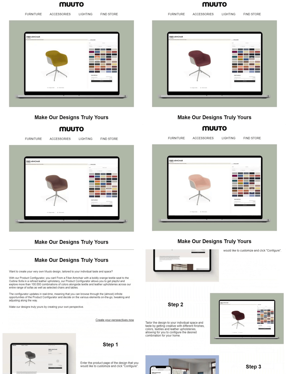
The Scandinavian design company, Muuto, uses GIFs to show customers how they can customize products step-by-step. Muuto’s product configurator allows customers to get playful and explore more than 100.000 combinations of colors alongside textile and leather upholsteries across its entire range of sofas as well as selected chairs and tables.
6. Introduce a new feature
Adopting new technologies for the sake of being cutting edge is a waste of time and money. Instead, the end goal should always be improving the customer experience.
Whether you’re enriching your product page with high-quality 360-degree views, product configuration, or augmented reality, or introducing visual search, buy now — pay later options, or virtual consultations, you should always communicate with your customers.
And what is the best way to introduce new features? Email marketing. Data from Bluecore shows that 74% of baby boomers think email is the most personal channel to receive communications from brands, followed by 72% of Gen X, 64% of millennials, and 60% of Gen Z.
This is one of the many reasons why building a list of email subscribers is essential for your furniture business. Next time you introduce a new feature, don’t forget to notify your customers.
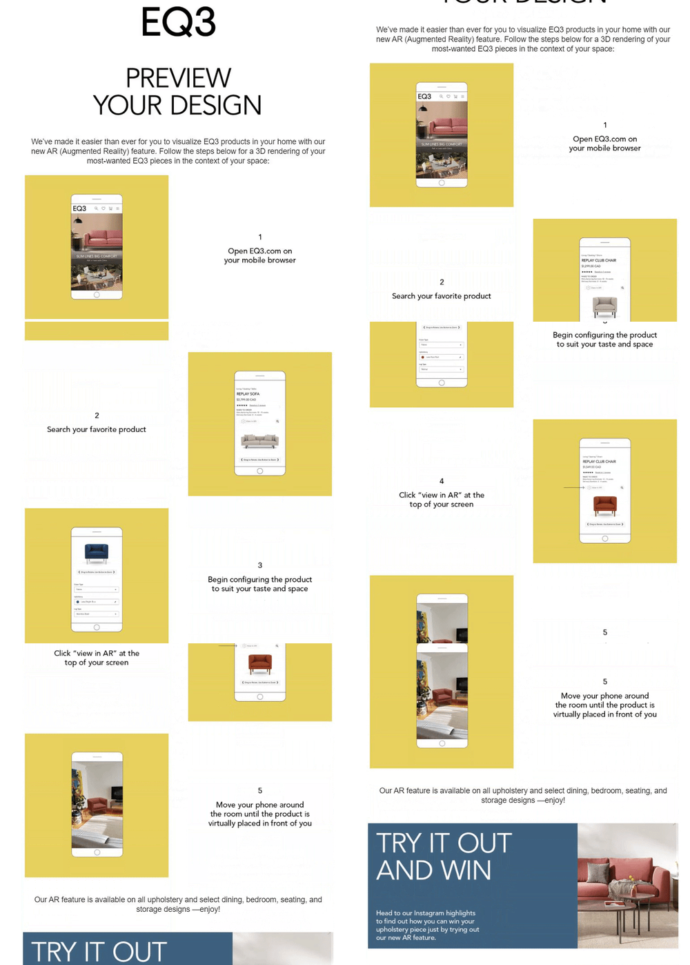
Case in point: EQ3
At the beginning of 2021, the Canadian furniture retailer EQ3 introduced a web-native augmented reality solution. To share the news with their subscribers, they sent an email with a step-by-step guide on how customers can check out the new feature.
7. Inspire customers with lifestyle shots
Just five years ago, the average consumer was looking for three images per product when shopping online. Now, that number has risen to eight product images, according to Salsify. Consumers are hungry for high-quality content that will help them make a purchasing decision.
Besides alternate angles, detail shots, and 360-degree visuals, another way to spice up your email marketing game is to use lifestyle imagery.
Even though the process of creating room scenes was costly and time-consuming in the past, thanks to 3D, creating in-context imagery is much more cost-effective because you don’t have to transport furniture all around the world just for a photoshoot. The best part is that by using this technology, you can create top-notch, photorealistic visuals that are indistinguishable from traditional photography.
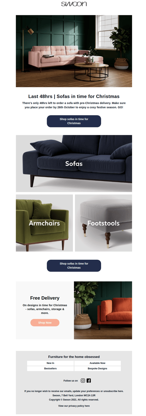
Case in point: Swoon
Swoon Editions is a UK design-led furniture brand that enables people to buy beautifully handcrafted furniture. The brand showcases its products in context and at scale with customizable lifestyle imagery. The ability to easily generate and iterate upon photorealistic lifestyle imagery at scale makes it easy for Swoon to serve a wide range of photorealistic content in their email marketing campaigns which aims to both inspire and manage their customers' expectations seamlessly.
8. Send promotional emails
Just like you should notify your subscribers about a new feature, you should always let them know when you have a limited promotion. People check their email frequently, and if you craft a catchy subject line and earn their click, you can enjoy dedicated attention, which makes email so effective.
Research shows that 99% of email users check their inbox every day, with some checking 20 times a day. In most cases, checking email is part of a morning routine — 58% of consumers check their email first thing in the morning.
Now, it’s up to you to design an enticing email offer using the power of behavioral triggers. For example, you can promote limited-time offers to wake up the sense of urgency or notify customers about limited collections (or ready-made items available for shipping right away).
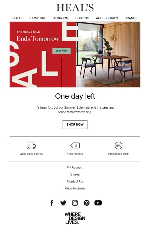
Case in point: Heal’s
The British furniture retailer Heal’s uses email marketing to promote special offers. During the Summer Sale, Heal’s had a sequence with a couple of emails reminding customers to take advantage of the opportunity to buy the piece of furniture they’ve been eyeing for a while at a discounted price.
9. Ask for feedback
The best way to find out what customers think is to ask them. There’s no way around it — your success depends on customers’ perceptions of your business. To be able to tailor the best experience for your customers, giving them a chance to share their thoughts can ease your job.
Getting feedback doesn’t have to be daunting. As many as 68% of consumers will give feedback if they’re asked. Here are some tips to keep in mind:
- Tailor your approach — If you want to know whether customers are satisfied with the shopping process, send the email to previous customers. If you’re interested in finding out why customers aren’t finishing their purchase, make sure to send the email to recent website visitors who have abandoned their cart.
- Keep it short — The email should be short and to the point. Don’t overwhelm customers with unnecessary information. The goal is to get their feedback on a specific topic.
- Offer an incentive — People value their time, so even if your goal is to improve the shopping experience, the question is: what’s in it for me? Offering a reward or a coupon can significantly increase the number of answers you get.
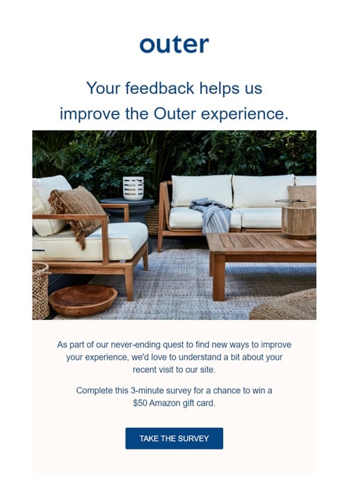
Case in point: Outer
The innovative outdoor furniture brand Outer uses email to collect feedback from its customers. The email is short and effective. Starting from the subject line, “We'd Love Your Feedback,” to the clear copy, Outer does a great job of communicating with customers why they’re asking for feedback. Customers that complete the three-minute survey have a chance to win a $50 Amazon gift card.
10. Decide on the frequency
One of the hardest questions for marketers: How many emails should you send per week? Data from Hubspot shows that almost 40% of marketers send 0-2 emails per week, and more than a third of marketers send 3-5 emails per week.
On one hand, you don’t want to spam subscribers because you’ll notice high unsubscribe rates. On the other hand, you want to leverage your email list to its maximum potential. Finding the sweet spot can be challenging, but the rewards are higher open rates and conversions.
One thing to note is that marketers are sending fewer weekly emails compared to last year. Instead, they are focusing on segmentation, personalization, and automation. The spray and pray approach doesn’t work. Create segments and tailor the messages for specific audiences.
According to our analysis, most of the leading furniture businesses are in the range of 3-5 emails per week, increasing the frequency of emails when there are limited-time promotions.
Bonus: Test, optimize, repeat
There are no shortcuts to success. Finding the right formula for an effective email marketing campaign takes time and effort.
All the best practices mentioned in this blog post will help you step up your game. However, it’s up to you to test, optimize, and then do it all again.
Companies that A/B test see email marketing returns that are 82% higher than those of brands that never include A/B tests.
Reinvent your email marketing with 3D content
Including high-quality furniture visuals, 360-degree visuals, and photorealistic lifestyle shots in your email marketing campaigns can help you engage and convert consumers. Now you can easily use 3D content for email campaigns in Klaviyo.
If you’re looking for ways to ease content production and elevate your digital experiences with photorealistic product visuals for any touchpoint of the furniture buyer journey, we should talk.

.png)
